 SHOP THE POST:
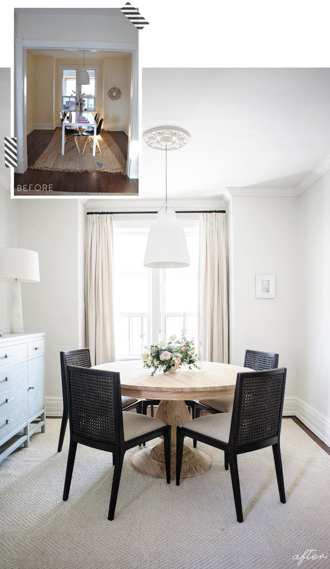
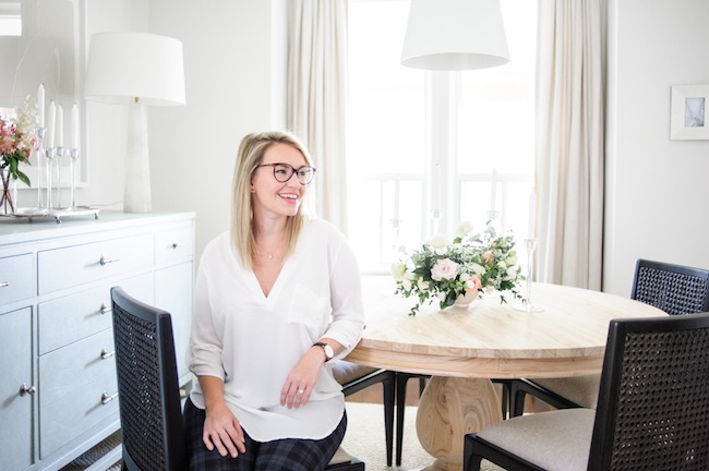
I wouldn’t go so far as to say I’ve mastered the entertaining game by any means, but it’s definitely something I’ve learned to thoroughly enjoy over the years. Whether it’s a formal gathering or a casual affair, there’s just something about your favourite people around a table amidst good food that simply can’t be beaten. We used to entertain fairly frequently back in our condo, and seeing as we’ve been renovating for the last year, it’s something I’ve missed fiercely since moving into our home. But alas, the renovations are complete (for now!) and I’m thrilled to share our dining room reveal with you today.
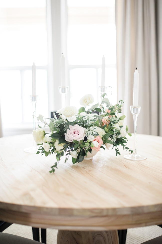
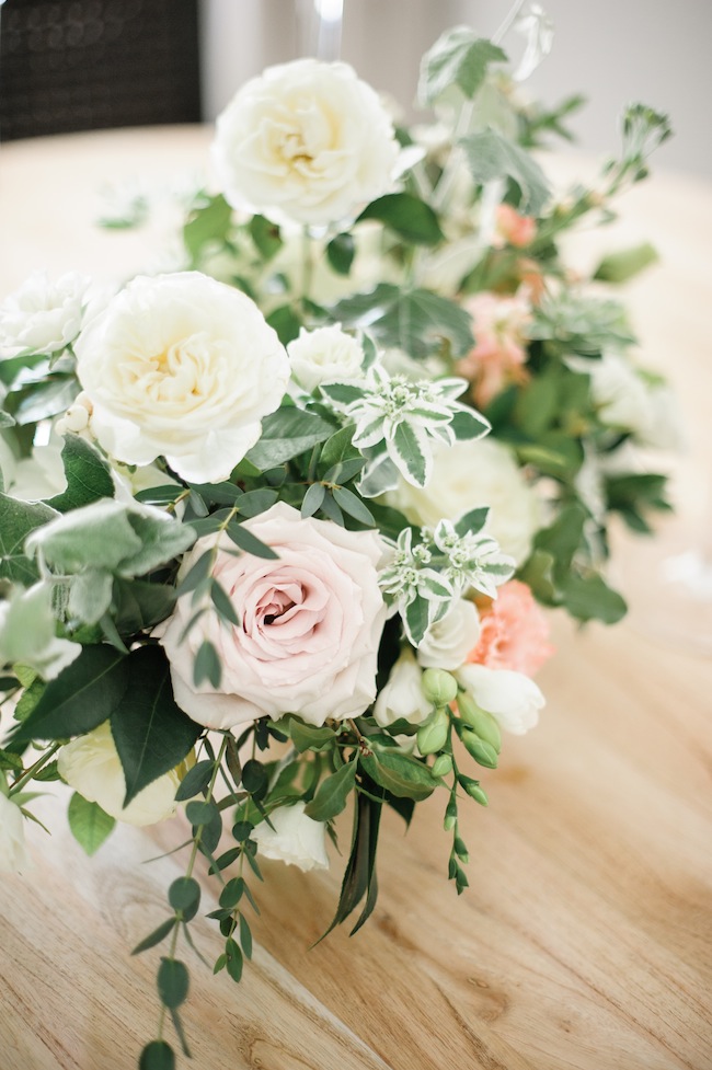
Before I dig in, I just wanted to touch on a little bit of housekeeping… First and foremost, I want to send Mrs Heidi Lau a big old smooch for capturing our dining room to perfection. And Threads & Blooms for helping with the stunning florals (if only I could have beauties the likes of these year-round). In addition, if you missed it, you can check out our dining room plan here. Funnily enough, things haven’t changed even an iota since that post went up. And it’s so fun to see those plans translate into real life.
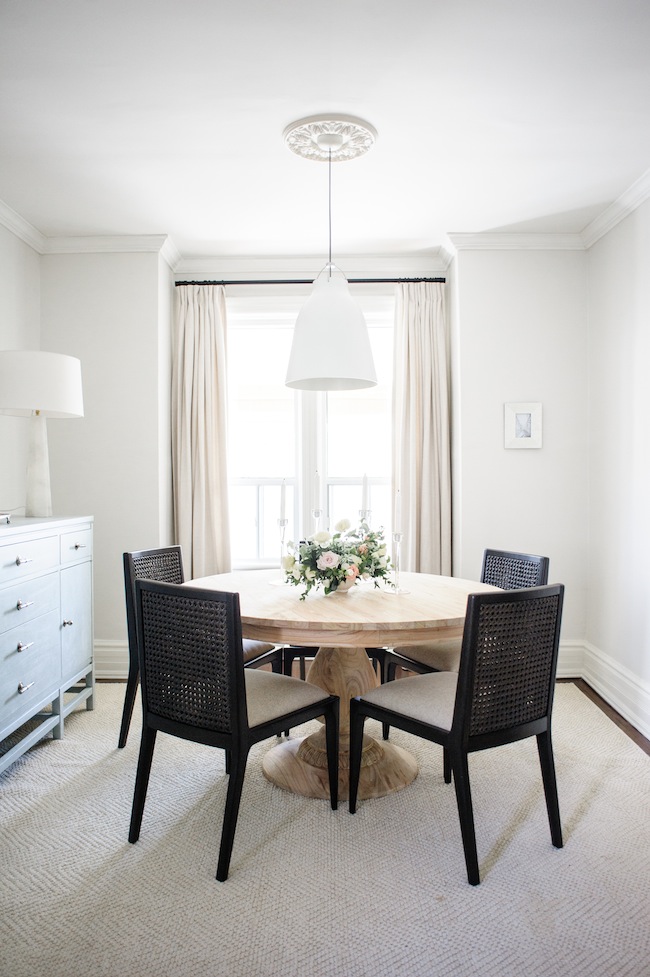
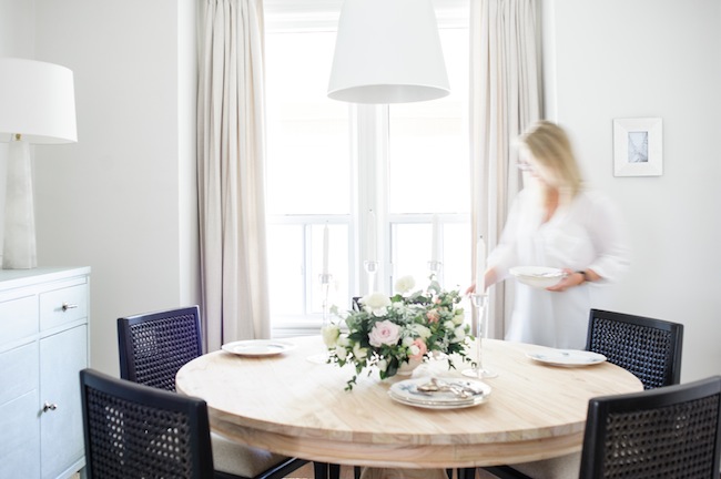
Our dining room is actually the one room in our house that really didn’t need a ton of work, as far as construction was concerned. Everything, including our 10″ baseboards (which I am OBSESSED with) was already in wonderful shape. We did, however, add some crown moulding (from Metrie), and a ceiling medallion above our chandelier to help up the ante on the detail front.
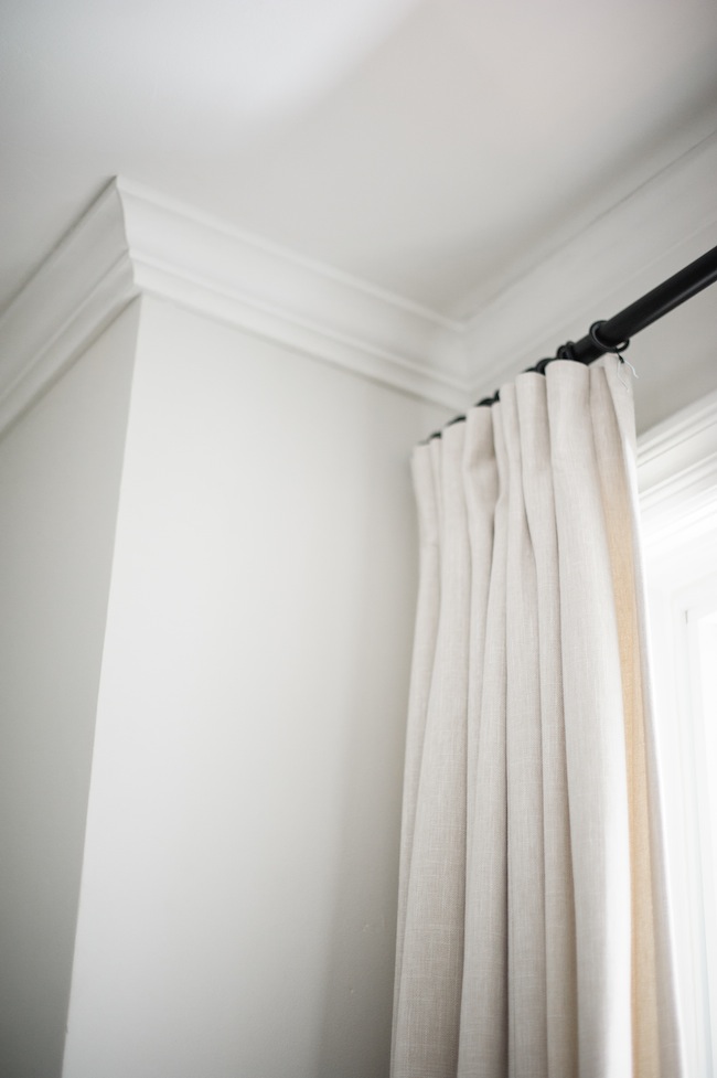
In addition, we looked to Tonic Living, my go-to, for our curtain needs. It’s incredible the instant difference a custom, tailored, set of curtains makes in a space. It’s these layers that help transform your house into a home.
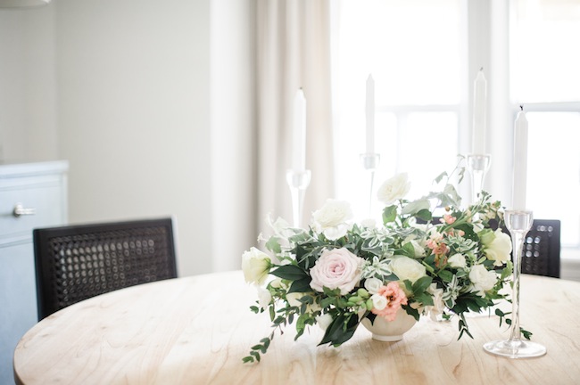
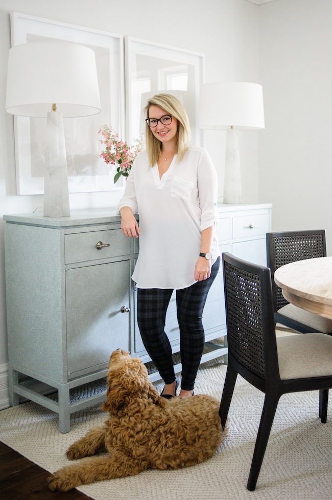
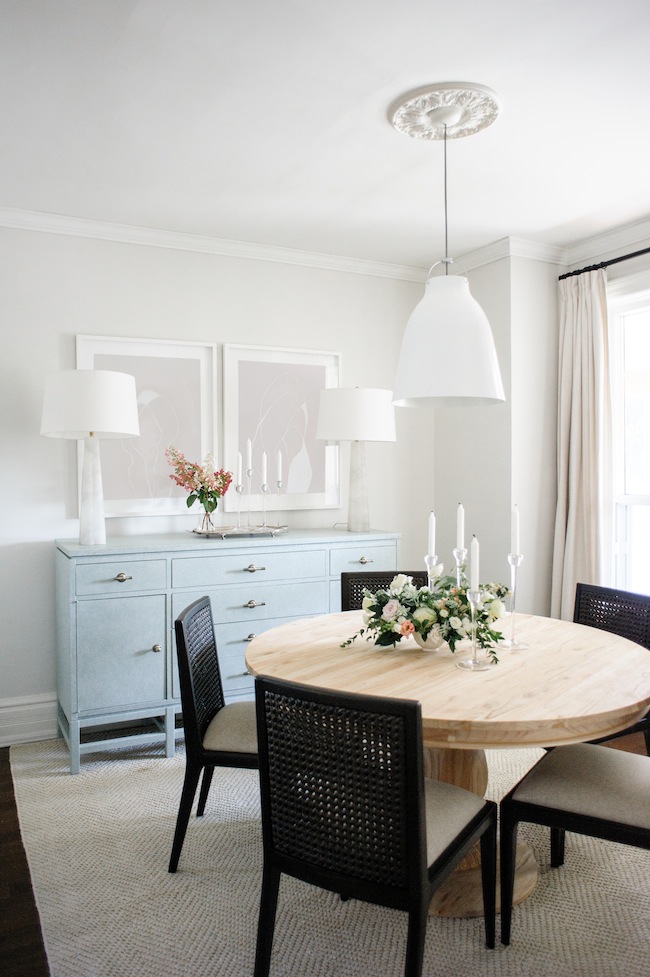
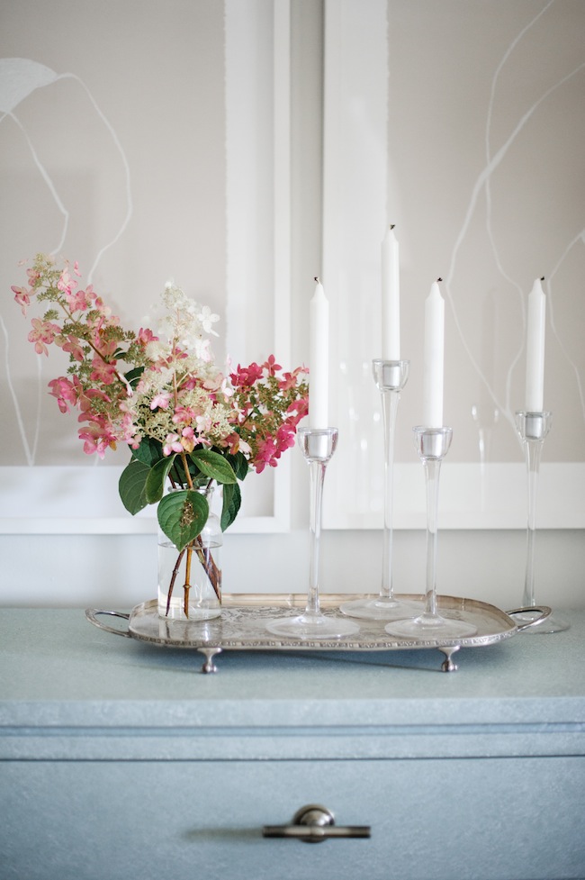
Much like a good set of curtains, getting art up on the walls is another one of those musts that help really pull a space together. Above our sideboard (which I’ll speak more on below), you’ll find two original Zoe Pawlak‘s – a Montreal based artist with whom I am completely and totally obsessed with. I feel like original art is one of those adult rights of passages. When I picked these two pieces it was definitely one of those “adulting” moments that I’ll remember forever. We then had them custom framed by my friends at On the Wall Framing, and I truly couldn’t be more thrilled.
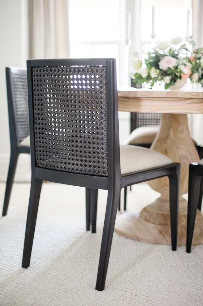
Our chairs, on the other hand, are items that I went back and forth on in my mind time and time again. Because our table (which you can find here) is quite traditional, both in material and execution, I wanted something a little more modern to act as a complement. Yet comfort was also of utmost importance. When I found these beauties on One Kings Lane, I instantly knew they were the one. The cane back speaks to the more traditional sentiment of our home, while the clean, simple, lines and ebony wood instantly added a modern flare. Add in the fact that they have an upholstered seat (making them insanely comfortable for long lingering dinners) and with that you have the perfect chair trifecta.
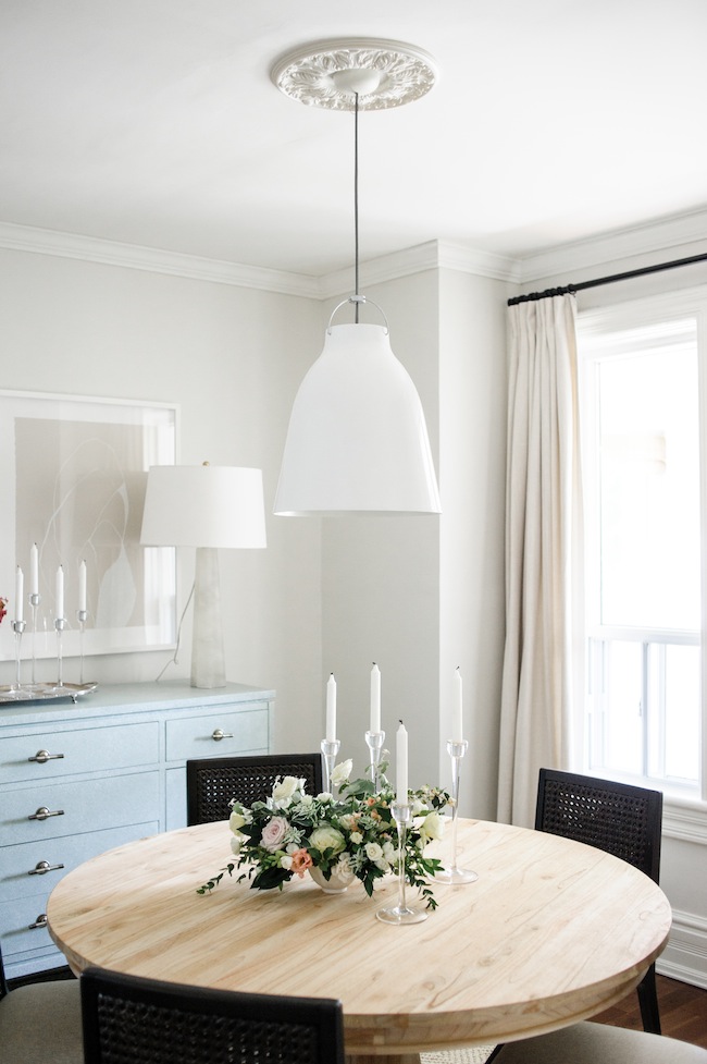

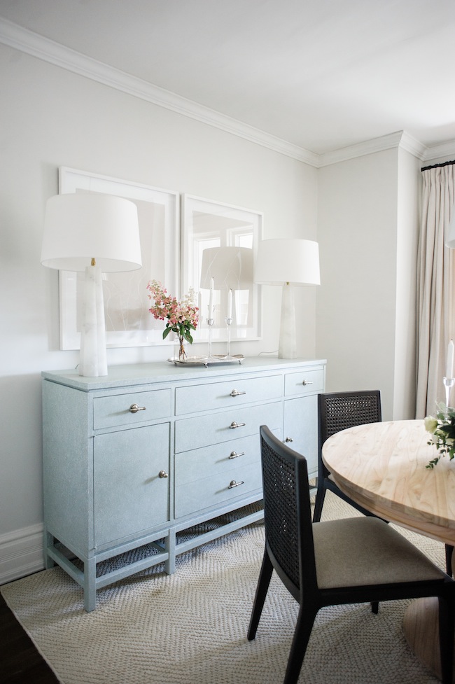
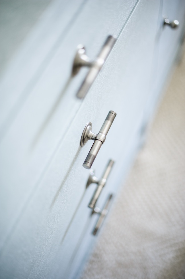
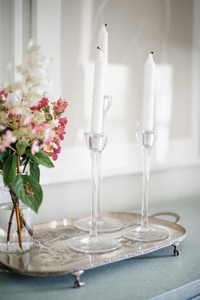
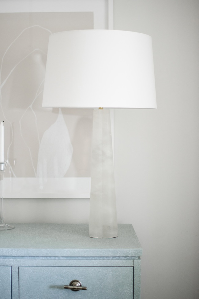
Now, the sideboard. Let us take a moment of silence for the sideboard, please and thank you. This baby is the one piece that I think I was the most excited about. Not only for the fact that it holds an insane amount of storage (which instantly sets my type-A heart aflutter), but it looks beautiful while doing so. Because, as you can see, our dining room isn’t huge, it was important that I found a piece that was raised off the ground so that we maintained some space to breathe. The robins egg blue hue is also a welcome addition to an otherwise monochromatic palette. I love that it clearly stands out, without fully taking centre stage.
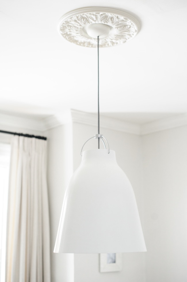
As mentioned in our bedroom reveal post here, lighting is another thing that I take particularly seriously. We actually reused the dining room pendant from our condo’s dining room (which is the only piece we were able to reuse), and upped the ante with the most stunning alabaster marble lamps on our sideboard.
There you have it! Our dining room reveal in all of it’s glory. Now, who wants to come over for dinner!?
SHOP THE POST:
SOURCES:
Photography: Heidi Lau
Flowers: Threads & Blooms
Design: Myself (Lark & Linen)
FURNITURE & ACCESSORIES
Buffet: One Kings Lane | Chairs: One Kings Lane | Table: Ave Home
Area Rug: Dash & Albert | Curtains: Tonic Living in Victoria, Oyster
Paint: Farrow & Ball – Strong White | Pendant: Caravaggio
Lamps: Houzz | Art: Zoe Pawlak
Custom Art Framing: On the Wall Framing
Ceiling Medallion: Lowes | Crown Moulding: Metrie
I’m Wearing
Plaid Pants: Nordstrom | Shoes: Old Navy
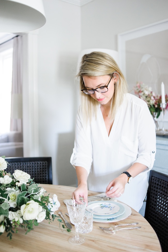
Blouse: Nordstrom | Glasses: Dior
Lipstick: Christian Dior – Saint Germain
filed in /


Beautiful! Just love that side board…the color!!!!
Hi Michelle, I wanted to chime in and say that I have to agree with you. The colour is so pretty isn’t it! And it fits so well in the space. Wouldn’t it be great if we could all find such lovely sideboards haha :)
Aren’t you guys sweet! I love the subtle hint of colour it brings. This is colour, Lark & Linen style haha
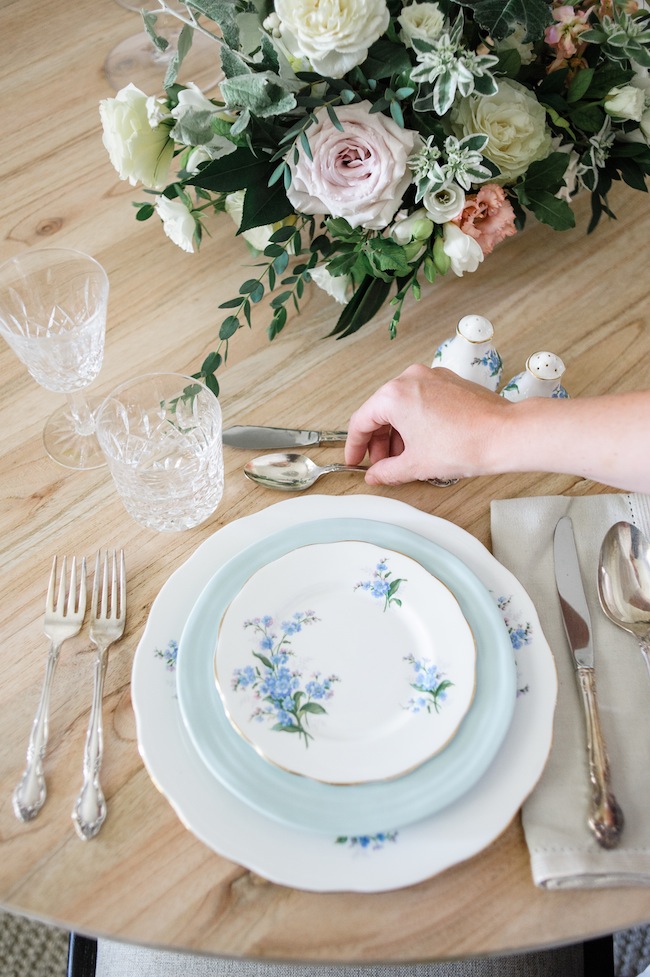
Beautiful Jacquelyn! I was looking for a link to your beautiful dishes!
Ah, sorry Michelle! They’re actually my grandma’s dishes. I believe they’re Royal Doulton
Your simple elegance is breathtaking!! xo
Thank you so so much
This is really an amazing transformation. Your dining room is looking elegant. Thanks for sharing this post.
Okay so 1: You are freaking adorable! How am I just now finding your blog?!
2: Your dining space is BOMB
3: Those frosted lamps are AMAZING
Loved this reveal :)
XO
Sammy B
love this comment! Thanks, Sammy
Gorgeous! I love how bright light and airy it all is. The whites and neutral tones are in such harmony and the china set is so delicate and lovely! Thanks so much for sharing your home with us!
Thank you for your sweet comment. It’s so encouraging that so many people like it!
Can I come over for dinner please??
Jacquelyn, this makeover is trying beautiful, I’m in love! The simplicity with subtle, detailed accents is perfect, along with the muted colours. I certainly wish my dining room looked like yours.
Well done on this amazing makeover, I think you’ve done a brilliant job. I also love that you are supporting local businesses and creators, so well done to you!
How long did it take to realise this final design?
Oh dear, I got a bit too excited and forgot to read what I had typed. Whoops!
I meant TRULY beautiful, not trying haha, apologies!
Thank you for this incredible comment, Emma. It took us about 6 months from beginning to end (though we were designing a few spaces simultaneously so I don’t know if that’s a super accurate timeline)
That’s pretty impressive for juggling multiple projects at once, nice work! I look forwards to reading about your future projects :D
Wow! I love your style. I was thinking of buying this table and am wondering how the wood has held up over the past year. Did you end up sealing it?
Thanks!
[…] Jacquelyn Clark […]