It’s no secret that I have a bit of an affinity for an all white space. I mean, my portfolio is chalk full of the stuff. And while you’d think that sticking to a single colour palette would be an easy way to tackle a room, doing it properly has its fair share of challenges. Without the right design tips and tricks in place one’s all white space can quickly go from dream-like to cold and sterile, and let’s be honest, nobody needs that. When it comes down to it, designing all in white is totally doable, but needs to be executed with a cautious hand. Following are my go-to tips and tricks for achieving that seraphic vibe, while ensuring your space feels warm and inviting at the same time.
INFUSE TEXTURE:
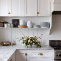
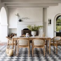
The biggest mistake I see when it comes to designing a primarily white space is not including enough texture – a surefire way to achieve a cold and lackluster space. Infusing a variety of textures throughout is a great way to add warmth and create interest, all while staying true to your palette.
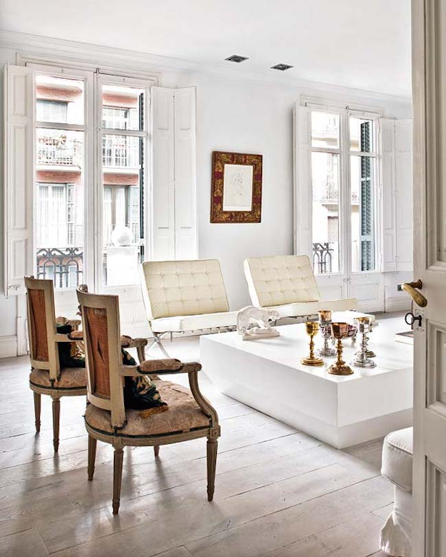 PLAY WITH SCALE:
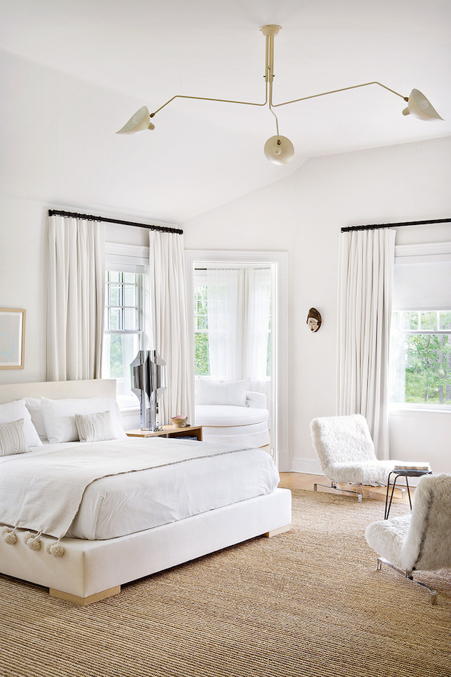
One of my favourite tricks when designing a primarily white space is to play around with scale. Some oversized art, a cluster of cocktail tables, a chunky coffee table, or an unexpected sculpture in the corner instantly adds interest, and ensures your home feels anything but boring.
 SUBTLE PATTERNS REIGN QUEEN:
While there’s something to be said about a bold print set against a white wall, chances are if you’re decorating all in white you’re looking for something a little subtler. I love infusing barely there patterns to keep things interesting, yet ensuring I stay true to the vibe we’re looking to achieve.
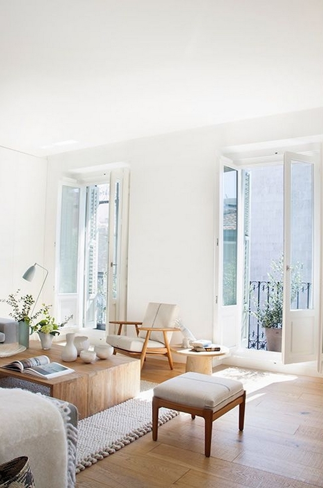
PLAY WITH TONES:
If you love the look of an all white space but worry about the cozy factor, try playing around with different tones. When it comes to decorating with white subtle shades of cream, soft ivories, and a hint of heather grey, all paired alongside one another, goes a really long way.
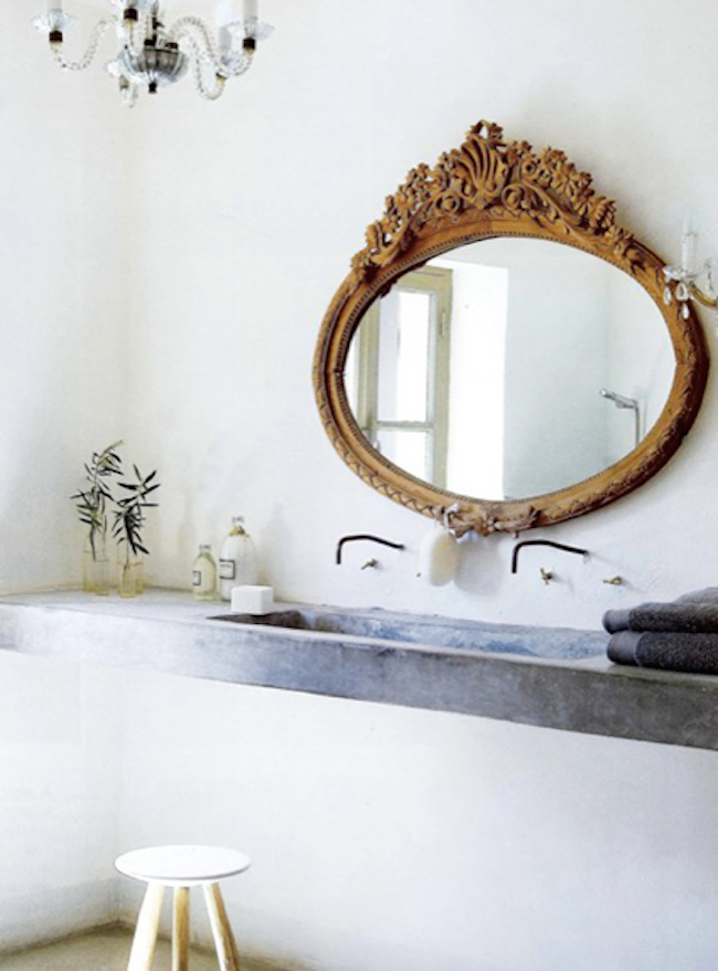 JUST ADD WOOD:
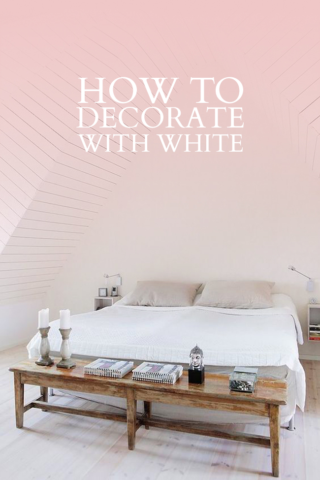
There isn’t much else that instantly warms up a space than a hint of wood. Whether it’s in the form of an antique dresser that deserves it’s very own moment, or a simple distressed stool in the corner, a hint of wood instantly grounds even the whitest of spaces.
SHOP SOME OF MY FAVOURITE ALL-WHITE ITEMS FOR YOUR HOME:
Shiplap Ceiling: Originally featured here | Infuse Texture: Originally featured here | Play with Scale: Originally featured here | Subtle Patterns: Originally featured here | Play with Tones: Decouvrir | Just Add Wood: Unknown
filed in /
