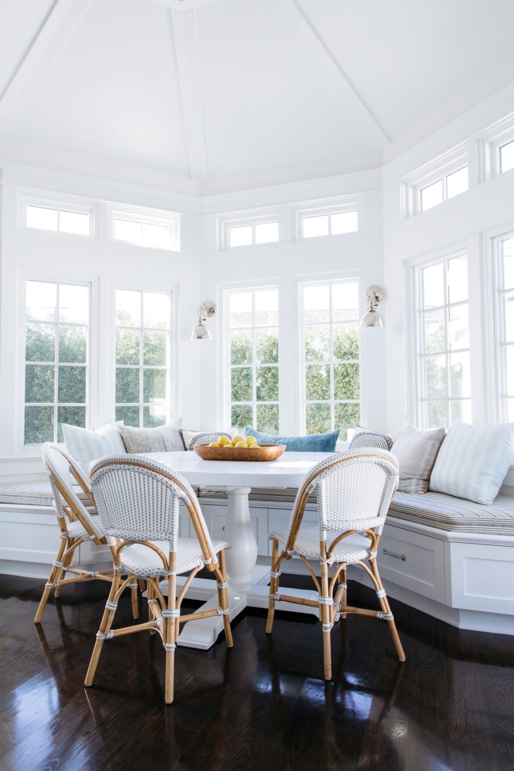
Photo & Design Source: Rita Chan Interiors
SHOP THE POST:
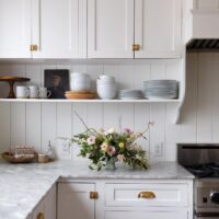
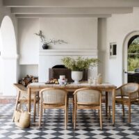
Much like designing this client’s foyer & living room, the dining room design was approached in a similar fashion. After taking stock of my client’s design q&a (and a deep dive into their shared Pinterest board), I knew that family friendly, casual, yet infinitely elegant was going to be the name of their game in this space. To achieve that exact vibe, I set out on a hunt to find similar spaces that felt bright and fresh, filled with subtle texture and pattern, with just a hint of sparkle. Here are a few inspiration images I originally presented to my client…
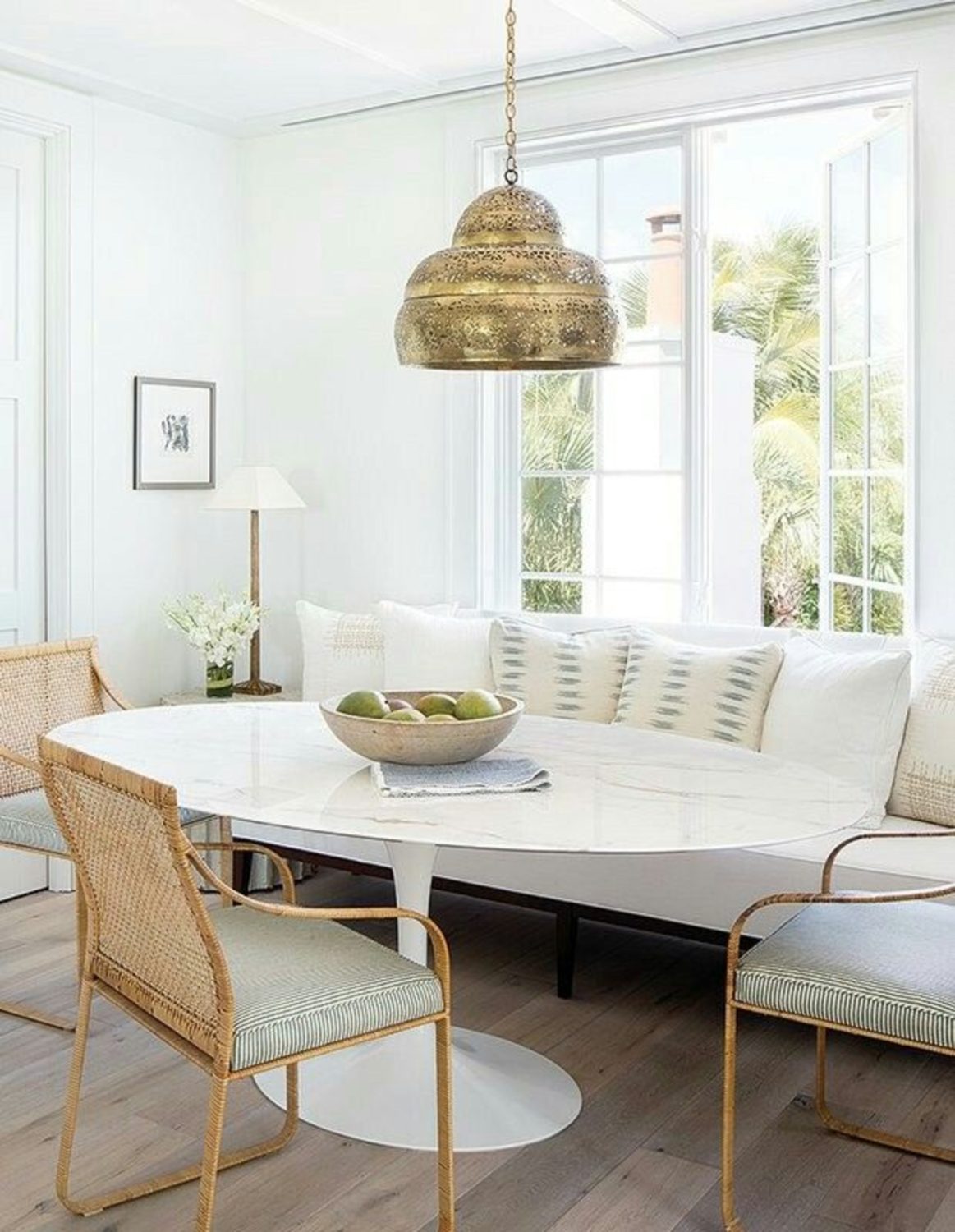
Design: Olivia Obryan Interior Design | Photo: Jessica Glynn
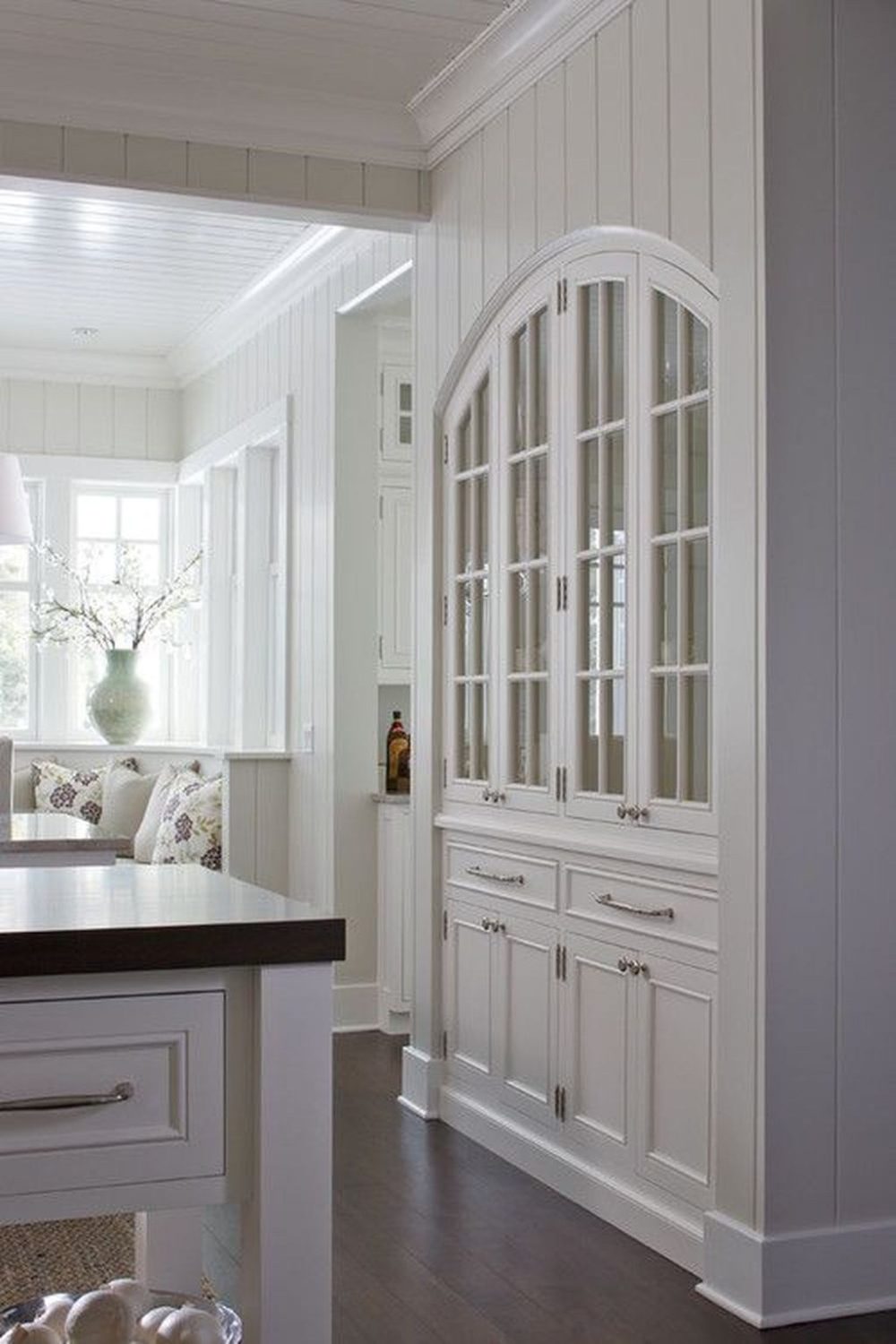
Photo & Design: Signature Kitchens
Equipped with a solid jumping off point, I quickly got to work sourcing the items that would help translate the vibe into the real deal. Here is along the lines of where we originally began…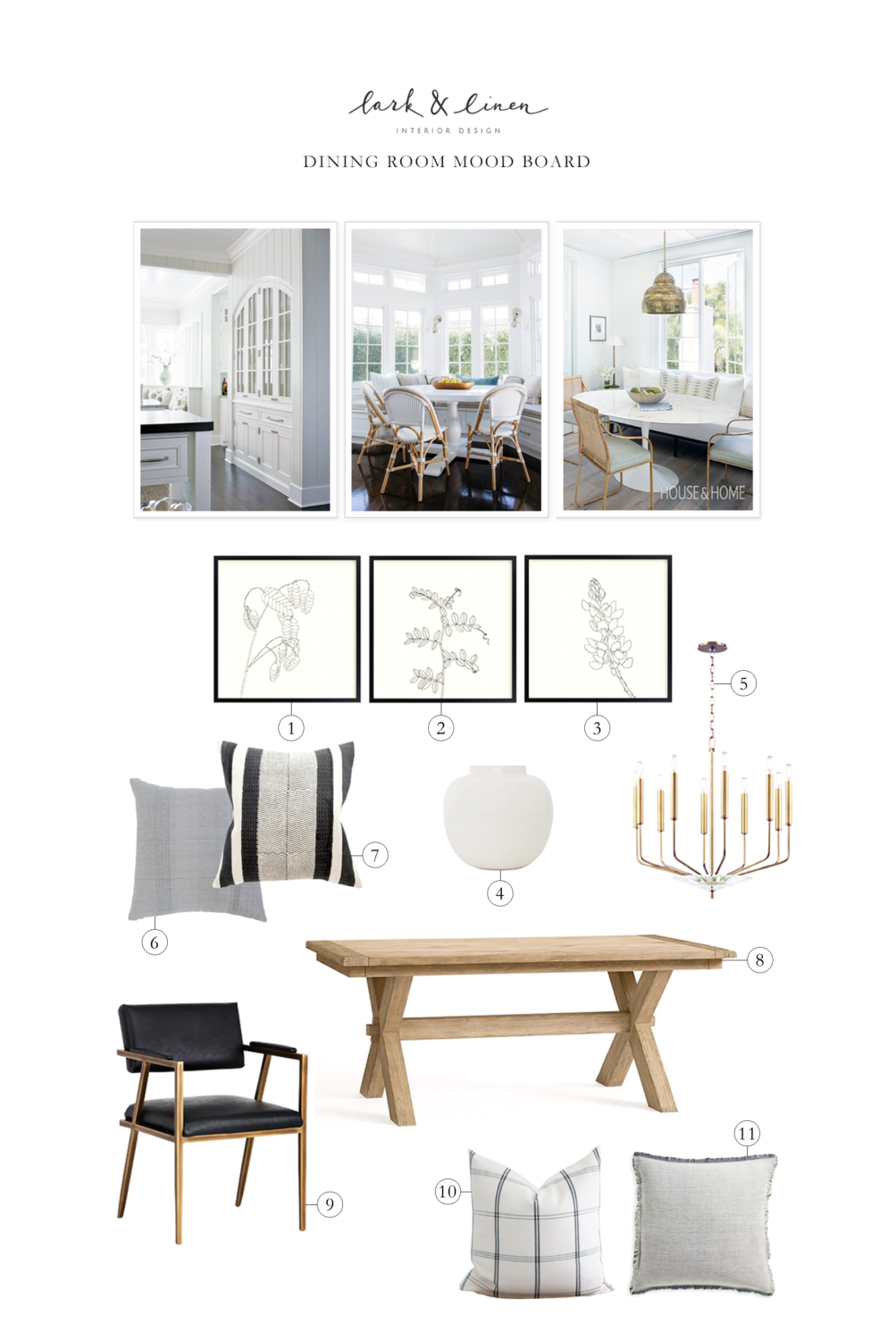
SHOP THE POST:
SOURCES :: 1) Art Print | 2) Art Print | 3) Art Print | 4) Vase | 5) Chandelier | 6) Blue-Grey Pillow | 7) Black & White Stripe Pillow | 8) Dining Table | 9) Dining Chair | 10) Check Pillow | 11) Light Grey Pillow
Ultimately, this is where we landed. Much like their living room, storage was essential here. With this in mind, we custom built a wall to wall bench designed to match their existing kitchen (seriously – you can’t even tell which came first – my millworker is such a gem). Not only did this addition to the space give us tons of additional storage below, but it also allowed us to tuck everything as close to the wall as possible, freeing up valuable square footage. Pin striped window treatments, a custom bench cushion, built-out in a high performance fabric, and a series of not-too-precious toss cushions added layers of warmth and texture, while the (wipeable!) faux black leather chairs brought in a hint of sparkle, and a dash of masculinity. All in all, I’m so thrilled with how this one came together.
For all of the final sources, in addition to more views of this dining room, head on over to the full reveal post for this project right here!
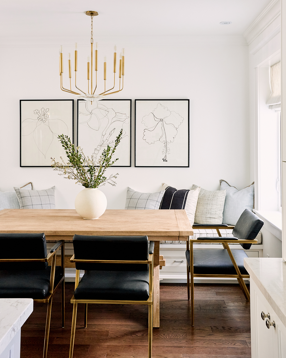
Photo: Will Reid
CHECK OUT THE REST OF THIS PROJECT HERE
filed in /


The styling is good, the design is good…but what about the ‘real’ work? Where are the ‘before’ photos? Where are the ‘in process’ photos? I mean, there were contractors, no? It takes many hands/skills to ‘makeover’ a space.
Of course it does! I don’t typically post process stuff simply due to timing, or lack there of. I’m already stretched so thin between running my blog and running my design business that documenting every single step along the way is simply impossible for me at this phase of my career. I do post a lot of process/in between stuff on Instagram though as things are progressing. I’ve recently started a highlight for each project I’m working on so folks who are interested in those items can follow along there
Hello Jacquelyn,
Always happy and inspiring to see all that beautiful work.
If it is possible do you know the source for those beautiful drawing (3) over the banquette.
Thanks for sharimg,
Céline
Hi Celine,
Unfortunately they’re only available to the trade. If you want to shoot me an email with your address I’d be happy to price them out for you!
Though the before picture is not available but i will say the dining came out beautiful. I like the art prints.
This is beautiful Jacquelyn! I love the bench cushion. How can I get something like that made?
Thank you!
Thank you so much! We had it made at Tonic Living. You just have to go to a local seamstress or workroom and give them dimensions, details, and fabric!