My sweet friend Heidi shot my newest client reveal months ago and it has admittedly been killing me not to share it in its entirety. But when Rue Magazine expressed interest in featuring it, I knew that the wait would be worth while. It was featured in their newest issue (which you can read here, if you’d like), and I’m so thrilled to be sharing even more with you here today.
I’m convinced that the most successful projects are those in which the client trusts you to their core. And this right here is a prime example. Located in Toronto, it’s a small one bedroom condo, but what it lacks in size it now makes up for tenfold in character.
This client in particular was an absolute dream to work with – we clicked from our very first meeting, and she essentially handed me her keys and let me have at it. She actually resides full time in Israel with her husband and two young boys, but purchased this condo to act as her pied-a-terre when she returns to visit all of her family and friends every few months.
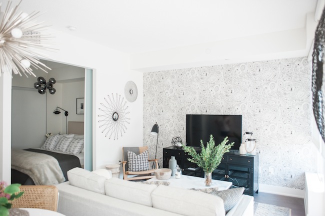 If I’m being honest, there was nothing terribly wrong with the space when she brought me on. The kitchen and bathroom were simple but functional, the main components, like the couch, rug, and dining table were already purchased, and I was more than happy to work around them. The main point of contempt was that the whole thing was void of personality. In her words “it simply didn’t feel like home” and she couldn’t figure out why. She brought be on shortly after she purchased, and attempted to furnish, the place, hoping I would be able to take it to the next level, and infuse more life and personality into each room.
 Like most projects, the scope of work definitely increased as we dug further into the design process. Originally, we had just chatted about adding in a few layers – some accessories, maybe a pillow or two – all those little moments that make a house feel like a home. By the end, we had practically gutted the galley kitchen, given the bathroom a full revamp, added wallpaper in the living room and foyer, and essentially touched every surface possible in one way or another. The vision was consistent: keep everything bright, simple, modern and airy, but infuse the entire place with life and character. The execution, on the other hand, definitely shifted as the weeks wore on.
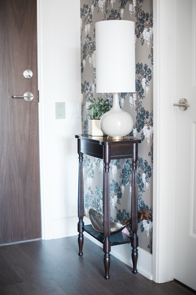
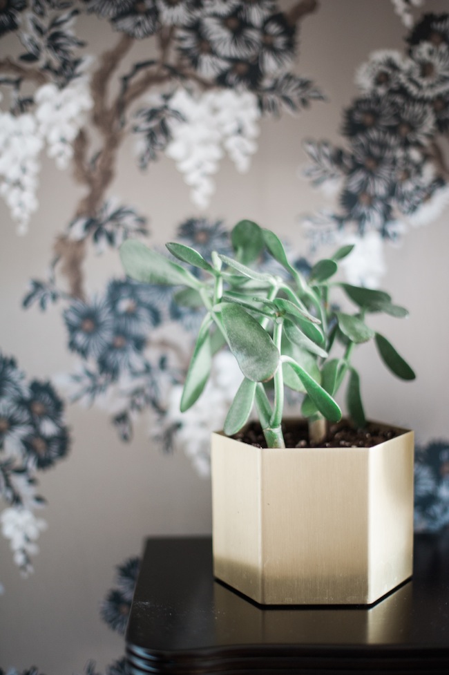 Though the foyer is small, there was no reason it couldn’t have it’s own little moment of wow. It was actually the perfect opportunity to play with pattern and scale, since it’s not a space that’s generally too precious. We replaced the builder basic “boob light” with a large, wooden, statement fixture, added a little telephone table and a dainty lamp, and defined the whole thing with the use of a modern floral wallpaper.
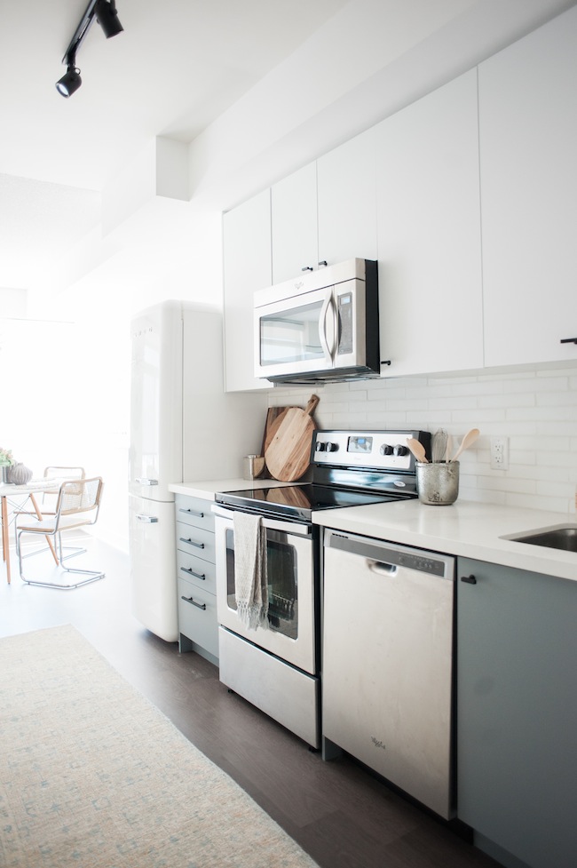
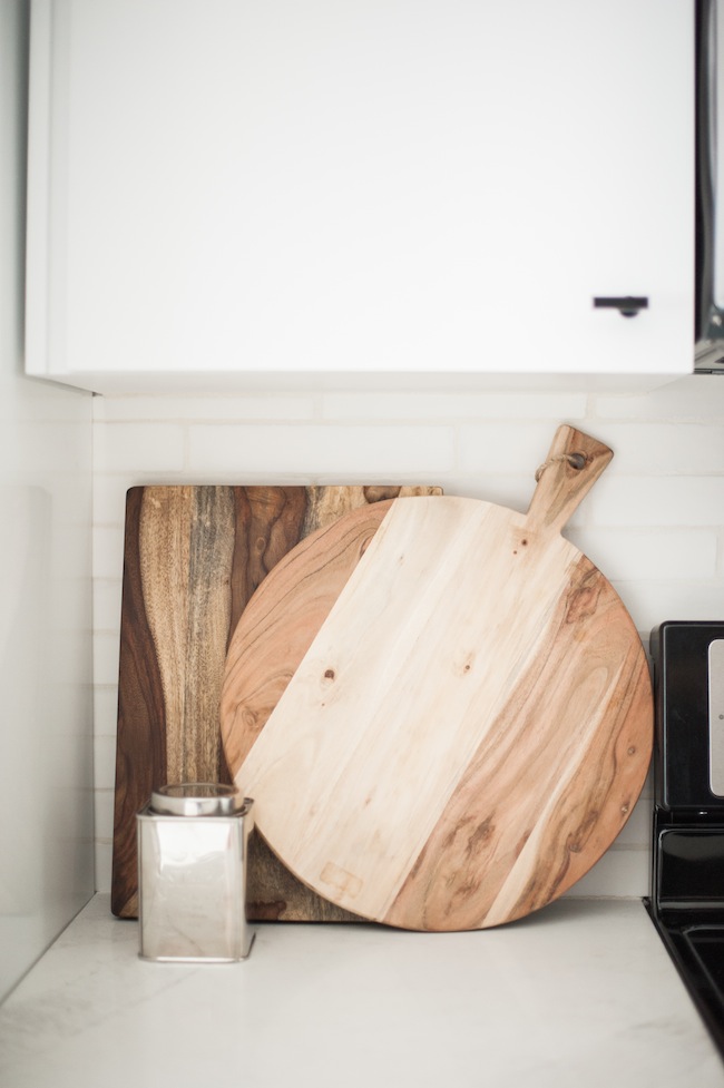
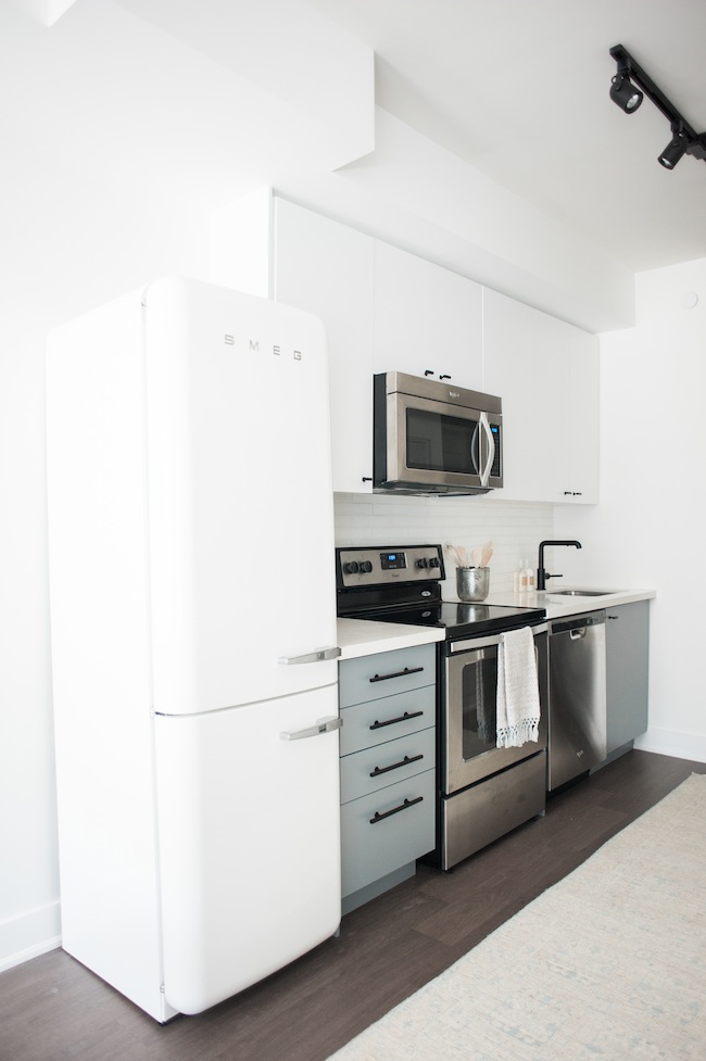 Since the kitchen is essentially the first thing you see when you walk into the condo, we wanted to make sure it held its own, but didn’t overpower the rest of the home. We kept the existing kitchen cabinet boxes, removed the built in fridge (which made the space feel cavernous), and painted the existing cabinets. We made sure to keep the colour palette simple and serene, splurged on a dreamy, conversation-worthy fridge, and infused texture and interest with the use of a stunning stone backsplash. A new caesarstone countertop, a modern faucet, and gorgeous cabinet hardware was enough to really breathe new life into the small but newly-mighty space.
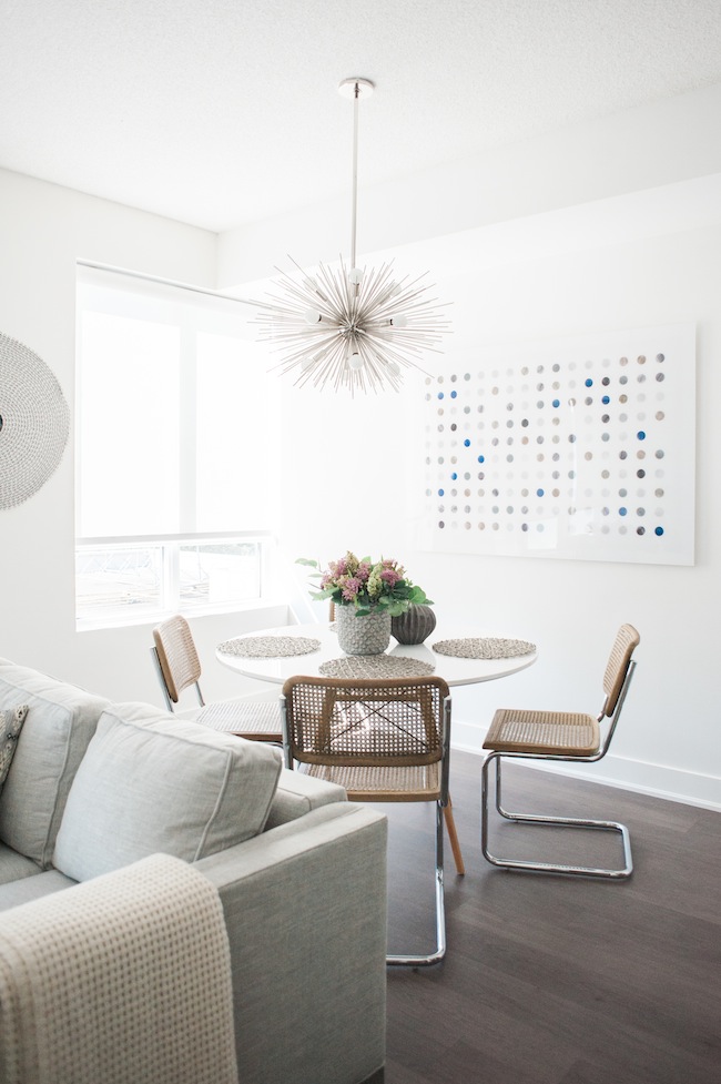
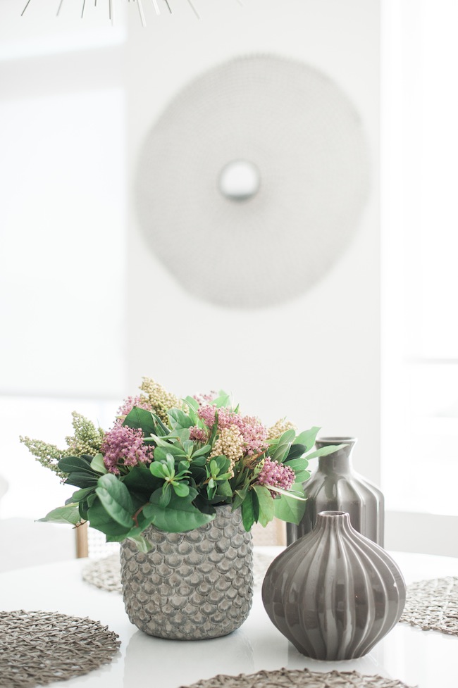
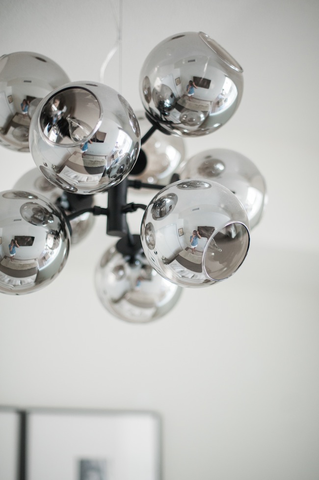
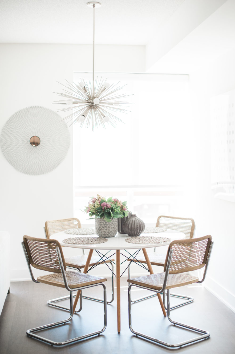 My client had already purchased the simple tulip-based dining table and the sputnik inspired chandelier, which were both the perfect scale and a definite win. The existing chairs, on the other hand, were just nothing special and the scale just felt off – they were quite substantial in size and really ate into the space. We opted to switch out the chairs for a lighter, airier, version. I also insisted on infusing a touch of wood to help up that warmth-factor she was so desperately looking for. We then relocated the polka dotted art that was originally hanging above her bed, and called it a day. Small changes, big impact.
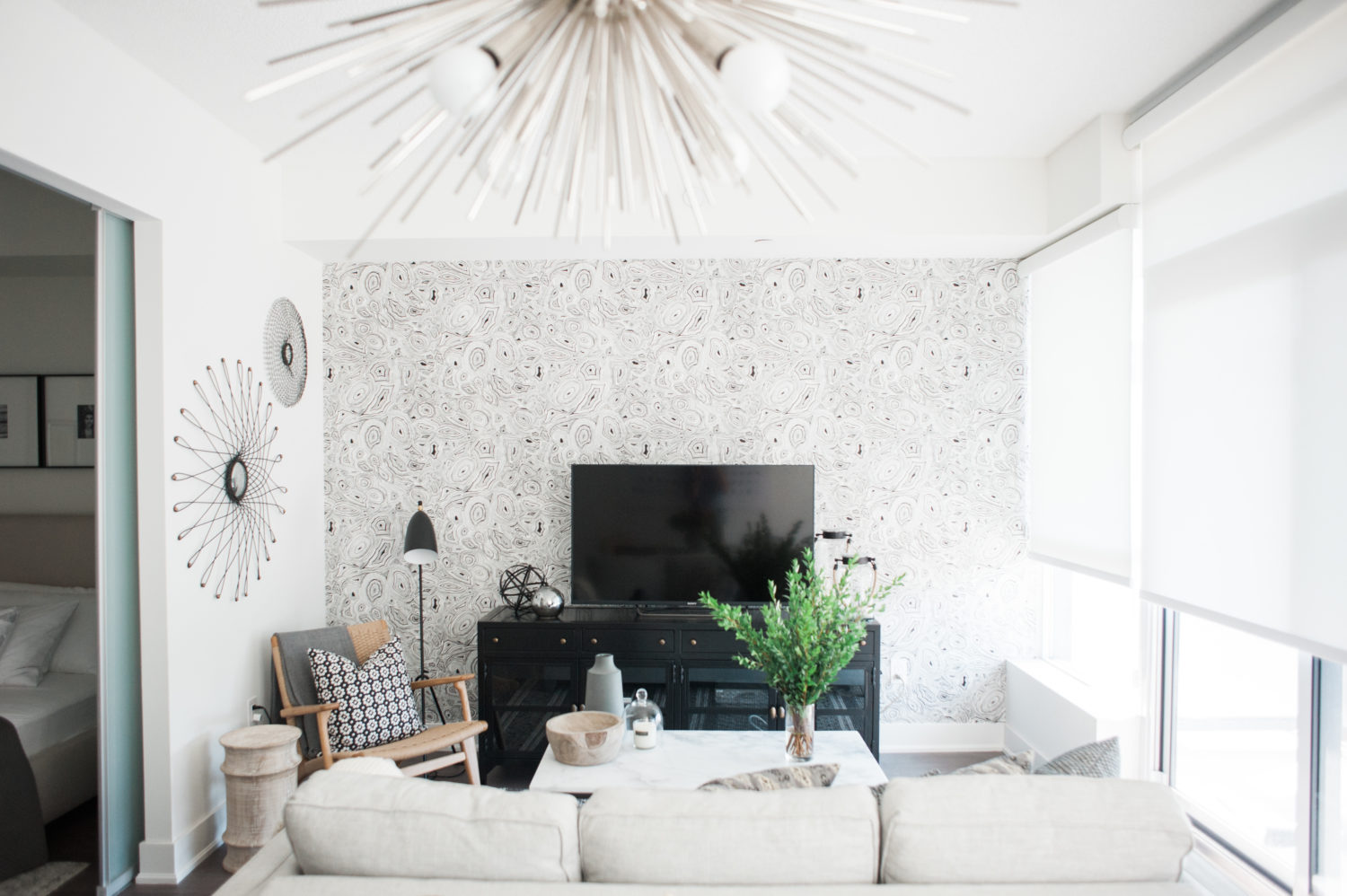
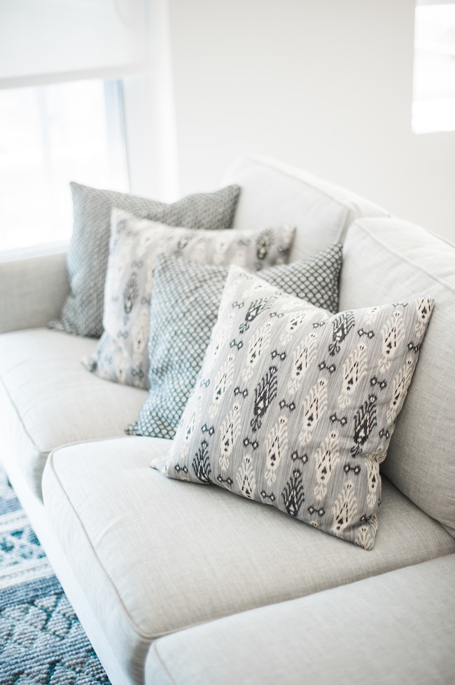
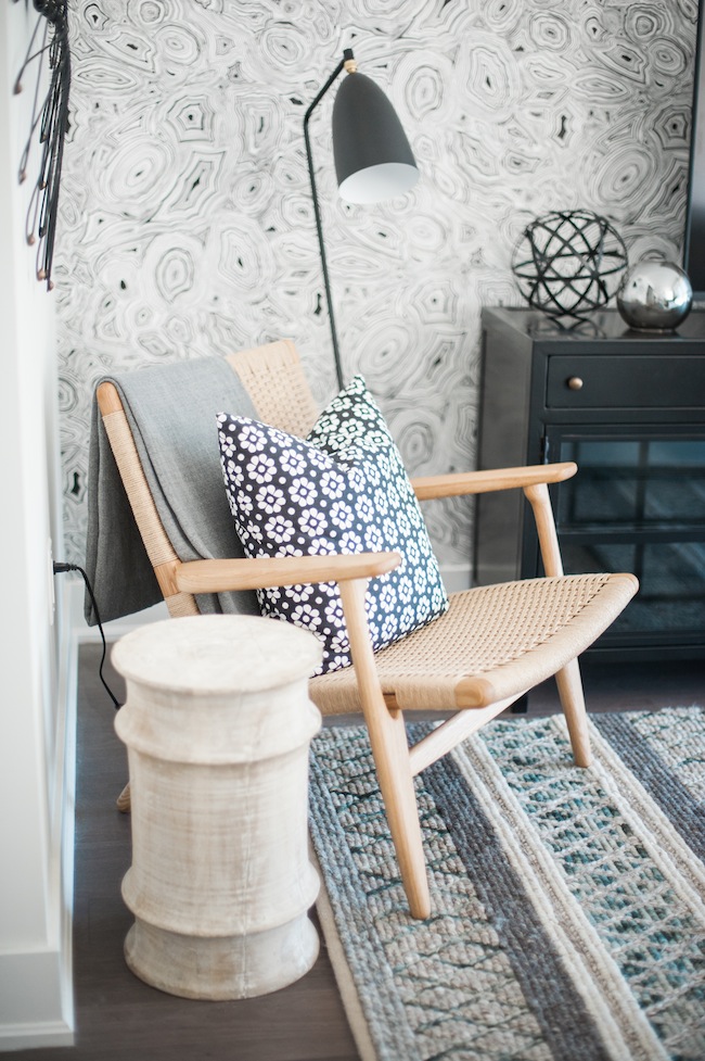
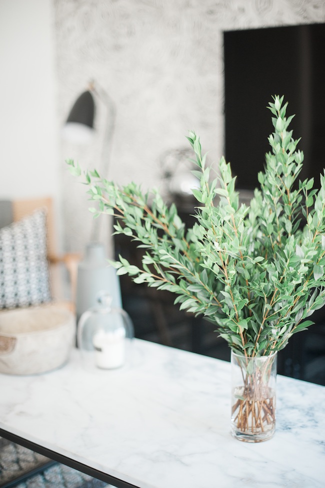
This was the space in which I really had a lot of fun. Like the dining room, my client had already outfitted this room herself, but we unfortunately had to sell everything with the exception of the rug and couch. We essentially started from scratch at that point. I found the black and white malachite wallpaper early on in the process, and it just embodied my client so perfectly that I knew it needed to act as our jumping off point. From there, I really got to work on playing up the modern meets cozy vibe my client was after. Keeping the whole “this needs to feel more like home” idea in mind, I really played with pattern, natural materials, texture and scale, while keeping the colour palette largely monochromatic.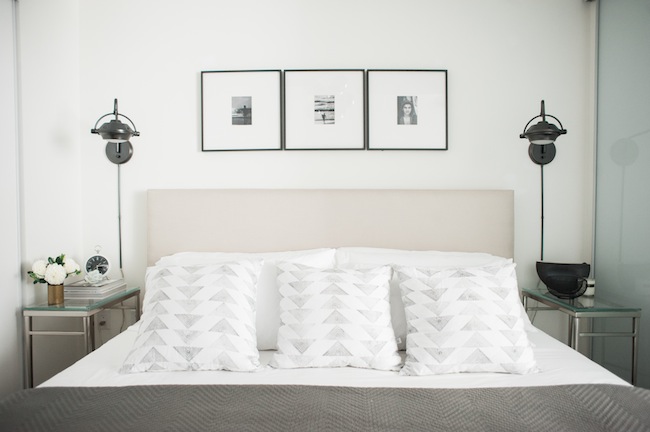
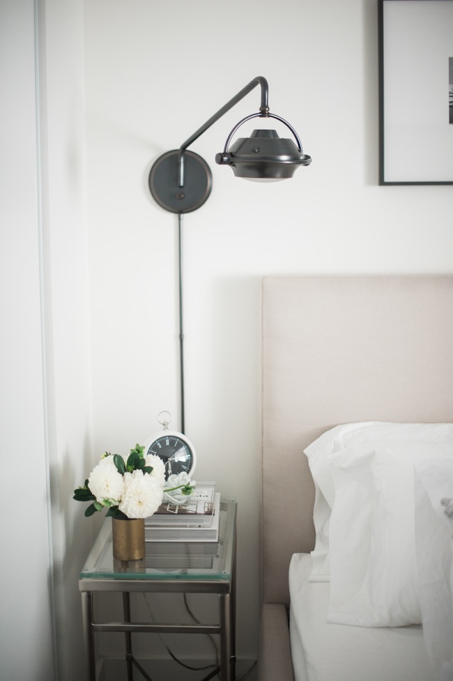
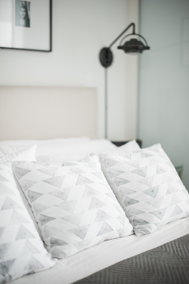
The bedroom, on the other hand, was virtually given a full makeover. A beautiful upholstered linen bed was put in place to add to those crucial layers. And in an effort to free up some space on the teeny tiny nightstands, we added some plug-in sconces. A pendant light was installed overhead, the bed was outfitted with sinfully soft linens, and topped off with a heavy quilt and the most exquisite block-printed toss cushions.
SHOP THE LOOK:
Interior Design: Lark & Linen | Photography: Heidi Lau
FOYER: Wallpaper: Cole & Sons | Telephone Table: Wayfair | Pendant Light: Arteriors | Lamp: Elte | Planter: PepperB
KITCHEN: Fridge: Smeg | Faucet: Kohler | Hardware: Lewis Dolin | Countertops: Ceasarstone, Statuario Nuvo | Backsplash: Mettro Source | Cutting Boards: Pottery Barn | Soap & Hand Cream: Ginger’s | Utensil Holder: Anthropologie | Tea Towel: Anthropologie | Track Lighting: Wayfair | Runner:Elte
DINING ROOM: Table: Existing | Chairs: Restoration Hardware | Vase: Anthropologie | Art: Existing | Pendant: Existing from Elte
LIVING ROOM: Couch: Existing from Elte | Rug: Existing from Elte | Side Chair: Design Within Reach | Wood Cocktail Table: Arteriors | Throws: Elte | Lamp: Design Within Reach | Media Unit: Black Rooster | Coffee Table: West Elm | Clear Jars: Pottery Barn | Candle: Pottery Barn | Cloche: Pottery Barn | Grey Vase: Elte | Wood Bowl: Anthropologie | Black White Floral Toss Cushion: Custom Made at Tonic Living using Jonathan Adler Fabric | Black White Cross Toss Cushion: Custom Made at Tonic Living using Lee Jofa Fabric | Ikat Toss Cushion: Custom Made at Tonic Living using Kravet Fabric | Wallpaper: Cole & Sons
BEDROOM: Bed: Elte | Pendant: ElteMkt | Nightstands: Elte | Sconces:Wayfair (Similar) | Pillows: Susan Connor | Alarm Clock: Pottery Barn| Knot: Elte | Vases: Elte | Frames: CB2 | Quilt: Restoration Hardware | Art: The Door Store
filed in /


[…] post Client Reveal: #LLProjectFaith appeared first on lark & […]
This is stunning Jacquelyn!!
The wallpaper in the foyer
and living room is gorgeous!
Thank you Peg! I was so thrilled when this client was as excited about the wallpaper as I was. I knew we were off to a good start at that point ;)
Everything is perfection! You have a gift–love the dining nook and natural wood accents especially.
You’re so sweet. Thank you, Tina <3
congrats on your feature! I adore the cabinets in the kitchen and the cool coloring through out. so refreshing and clean!
Thank you so much Natalie!
Just beautiful. Love your ability to mix so many prints from the wallpaper,to cushions, then the rug. It definitely looks like home!
Thank you, Angie!
Beautiful designs! Love how everything looks simple and cozy. Working on having a similar look for my condo with the team at Furnishr, you may want to check them out.