This post is in partnership with BEHR®
 SHOP THE POST:
Much like our bathroom (which you can read more about here), the minute this home became ours, I began brainstorming ways in which to transform our kitchen. While it’s generous in size, at least by Toronto standards, my fiancé, Justin, and I have discussed big plans for a mudroom and powder room extension, as well as a full kitchen gut and renovation. It’s something that’s been on our to-do list since we purchased our home late last summer, but with a busier-than-ever business, and our upcoming wedding, we’ve decided to put said major reno on the back burner, at least for the time being.
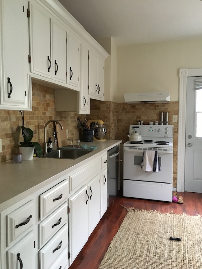
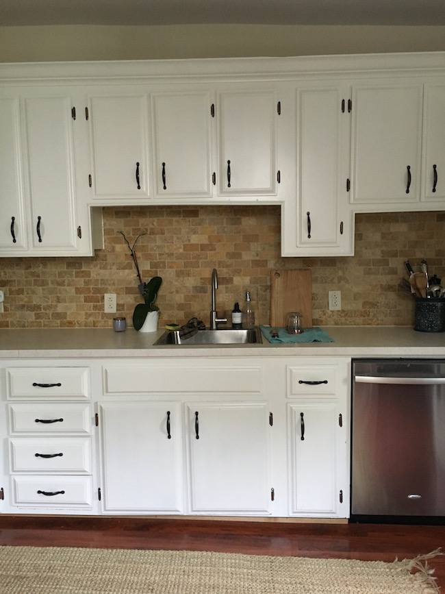
While I originally had every intention on simply living with the current state of things, the bleh beige backsplash, heinous ceiling fan, and cream coloured walls (which were abundant throughout our home – thank god this is almost the last of it), were starting to get to me. So when we returned from our vacation not long ago, I found myself with a less-than-busy weekend, and decided to take it upon myself to make some quick, and easy, changes…
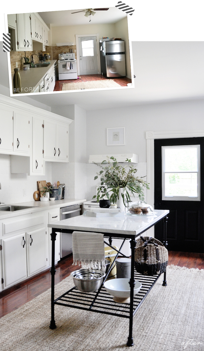
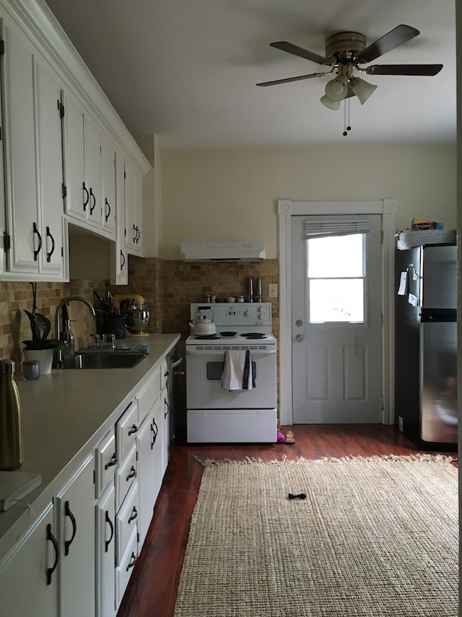 {BEFORE}
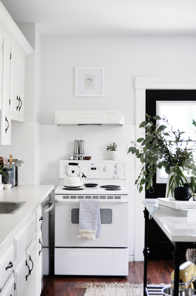
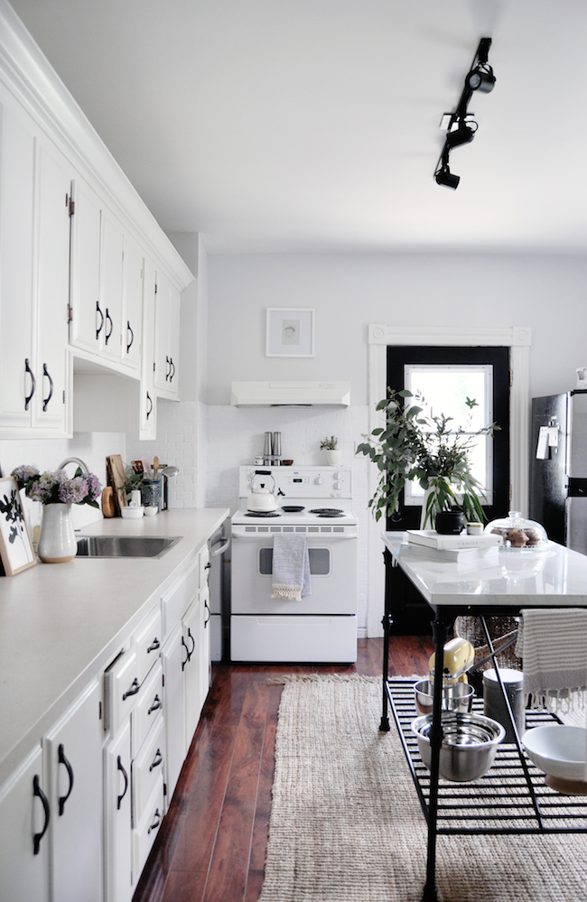
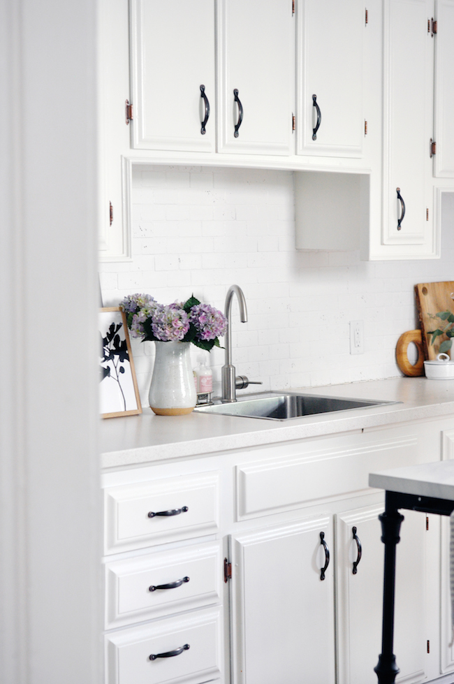
The first order of business: to be rid of those sad, creamy-yellow walls. I used BEHR® MARQUEE® Interior Paint & Primer in MQ3-4 – Quiet on the Set, and felt immediate relief the moment the first (and only) coat went up. This formerly sad little space instantly felt refreshed and rejuvenated, not to mention significantly lighter and brighter. My designer heart is still satiated every time I catch a glimpse.
{AFTER}
Truth be told, the most labour intensive part of the whole ordeal was taping everything off. Much like designing a room, the key to painting one is to lay that proper foundation. Come up with a solid plan and make sure you have all the proper tools (ie: paint brush, roller, tray, painters tape, a wet rag for any drips and spills, and excellent quality paint), before you begin. Once the room was taped off, which took the better part of an hour, I got to work. And because BEHR® MARQUEE® is such a high quality paint, I only needed to apply one coat – which was its own kind of glorious.
{BEFORE}
{AFTER}
At this point I was thrilled to be rid of all of that creaminess, but things started to feel a little too stark (apparently even I have a limit when it comes to light and bright). I decided to give our back door a lick of black paint (note: I used BEHR® MARQUEE® MQ5-05 Limousine Leather, which is a true, deep, rich black) and was amazed at how it instantly grounded the entire room.
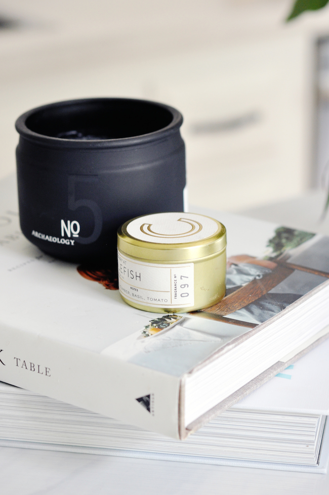
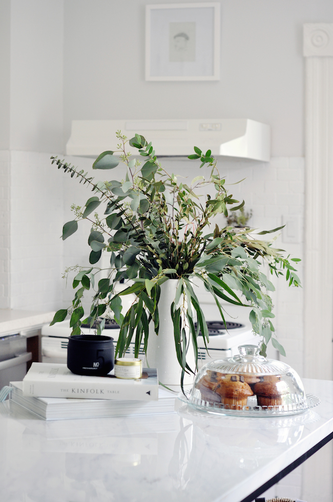
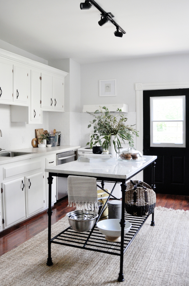
From there, I began to play around with all of the fun and frivolous bits. Because I didn’t want to spend a ton (since it really is just phase one of a two phase ordeal), I decided to pick up just a few key pieces, all while keeping our budget in check. This island was just the right scale, came at a digestible price point, and truly transformed our space. The hint of black, much like our back door, helped ground everything, while the added counter space has been an incredible addition. The fact that it’s really pretty certainly didn’t hurt, mind you. Form and function at its very best.
{BEFORE}
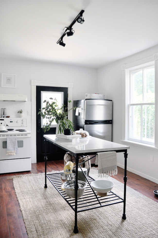
{AFTER}
And, aside from a picking up a few pretty accessories (which we will certainly keep, and utilize, once phase two comes into play), we also switched out our never used ceiling fan for a simple, inexpensive, but no less elegant track light. Another small detail that made a significant difference when all was said and done.
{BEFORE}
{AFTER}
Although I’ve been doing this for over a decade now, it will never fail to amaze me the difference a simple gallon of paint can make on a space. My only regret is that I didn’t do this sooner. I swear our food even tastes better these days.
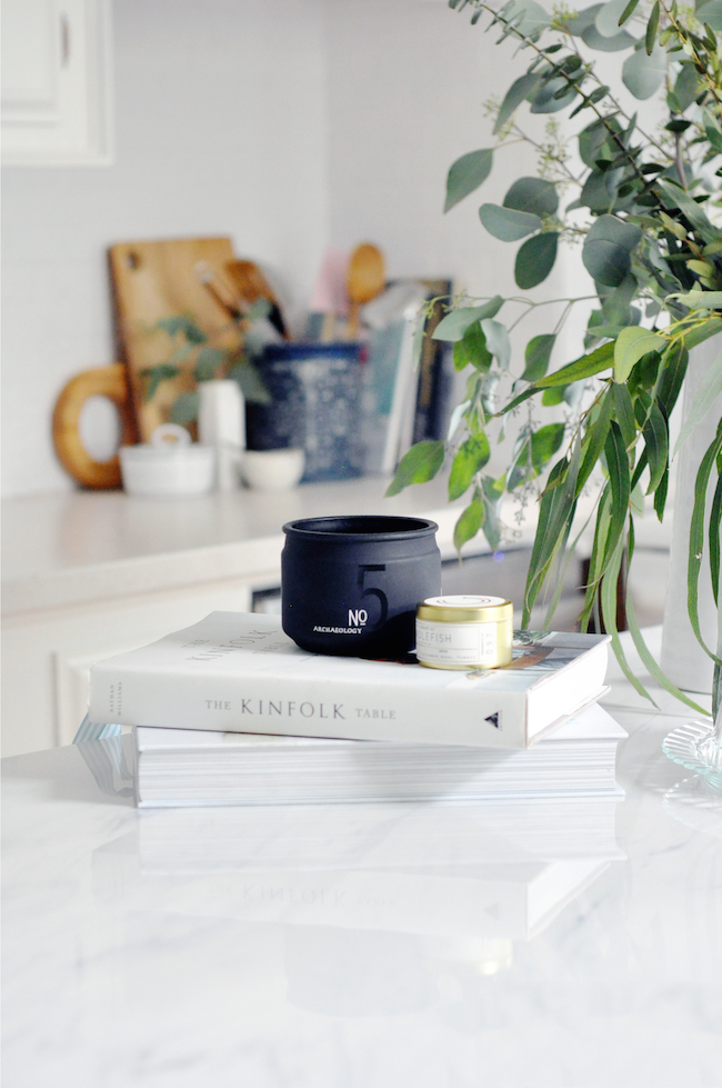
![]() Sources: Wall Colour: BEHR® MARQUEE® – Quiet on the Set | Backsplash Colour: BEHR® PR-W14 – Bit of Sugar | Door Colour: BEHR® MARQUEE® – Limousine Leather | Island: Similar Here | Track Light: Wayfair | Kinfolk Cookbook: Food52 | Tomato Basil Candle: Anthropologie | Navy Tea Towel: Anthropologie | Grey Tea Towel: Pamuk & Co. | What Katie Ate Cookbook: The Cross | Pitcher: Pottery Barn | Fruit Bowl: Pottery Barn | Wicker Basket: Pottery Barn | Silver Basket: West Elm | Salt Cellar: Hawkins | Sugar Bowl: Anthropologie | Honeysuckle Soap & Lotion: Anthropologie
Sources: Wall Colour: BEHR® MARQUEE® – Quiet on the Set | Backsplash Colour: BEHR® PR-W14 – Bit of Sugar | Door Colour: BEHR® MARQUEE® – Limousine Leather | Island: Similar Here | Track Light: Wayfair | Kinfolk Cookbook: Food52 | Tomato Basil Candle: Anthropologie | Navy Tea Towel: Anthropologie | Grey Tea Towel: Pamuk & Co. | What Katie Ate Cookbook: The Cross | Pitcher: Pottery Barn | Fruit Bowl: Pottery Barn | Wicker Basket: Pottery Barn | Silver Basket: West Elm | Salt Cellar: Hawkins | Sugar Bowl: Anthropologie | Honeysuckle Soap & Lotion: Anthropologie
Thank you to BEHR® for partnering with me on this post. And thank YOU for supporting my sponsors. I really wouldn’t be able to tackle projects of this variety without all of your support. It means the world. Truly.
filed in /


It looks wonderful!
Is the backsplash tile or brick? Did you treat the tiles before painting? Did you use special paint?
I understand the utility of a ceiling fan in a kitchen, especially if you don’t have A/C. But a model that’s a little less ’80s. The track lighting is going to give you much better light for working than the light on the fan.
It’s a tile backsplash. We did treat it with a special bonding primer, but we didn’t use a special paint. I don’t recommend this though – it’s definitely just a temporary solution until we redo our kitchen entirely!
Love those pictures especially afterwards :)
haha thanks, Marry. I’m partial to the afters myself
It looks amazing! What a difference a little paint makes!
I’m still shocked every time, and I’ve been doing this for 12 years now
Did you paint over the backsplash?! I am dying to get rid of ours (very similar colour to the one your previously had!) and am so tempted to paint it.
We did. I wouldn’t necessarily recommend it – it’s definitely just a short term solution until we redo our kitchen entirely, but it’s a great short term solution :)
Jacquelyn, I am in LOVE with your kitchen! Especially your Limousine Black interior door! I am developing a total crush on interior black doors lately! :) The perfect blend of freshness, warmth and texture! Love!
Thanks so much, Michelle. The black door definitely helps ground all the white. It was a must!
Wow Jacquelyn! You did an amazing job. Paint always works wonders, it’s quite incredible how it can transform a space! Well done, I love it. Holly xx
Thanks so much, Holly. I always say that paint is the cheapest way to TOTALLY transform a room
Love it! Great idea to paint the backsplash–it looks amazing in white!
Thanks so much, Tina. I’m MUCH happier in here. ANd it’s amazing how much of a difference, even functionally, the island makes
Looks lovely! Maybe you could do a post on how you painted your cupboards? I want to do mine but I’m intimidated!
I actually didnt’ touch the cupboards! They just look a lot brighter now that they aren’t being washed out by the grellow walls :)
[…] post How we COMPLETELY Transformed Our Kitchen In One Weekend appeared first on lark & […]
Oh wow, Jacquelyn, what a great transformation! And all coming from a lick of paint? You really are an expert in interiors! I can’t believe the difference.
That island is gorgeous too, would you call it a ‘faux island’? It ties in so well with your theme.
I can’t quite tell, but did you change the work tops too? Or do they just look brighter because of the now white walls?
Thanks for sharing it with us! :)
RIGHT? Paint wins every single time.
We didn’t change the countertops, they just seem SO much brighter now with all the changes
I love the black drawer handles and kitchen island frame against the fresh white!
Thanks, Jake!
Freaking amazing transformation, Jacquelyn! What an impressive before and after!
Jordana
Thanks Jordana! I had a feeling you’d like this one haha
Wow – looks like a whole new space! I second Emma’s question above about the countertop. What material is it? Thank you!
It’s actually just laminate! It’s the same counter as before, it just feels a lot brighter now that it’s not surrounded by a bunch of muddy shades
Crazy difference! Looks great
Thanks, Rachel!
I love the white painted backsplash! Normally I’m not a fan of going all-white but it actually highlights the warm tones in the floor and brings them out more. Looking back at the unpainted backslash, it actually felt too color-busy. And I love, love, love the island!
Thank you so much, Kristin! I was a little worried about all the white myself but I think the wood and the metal elements definitely help ground everything, you’re spot on
Completely gorgeous transformation in such a short space of time.
[…] This bathroom remodel is simple and lovely. So is this kitchen! […]
Looks amazing! What color paint did you use on your ceiling and kitchen cabinets? Do you think these colors would look good with a crimson/khaki color sofa?
Hey Nicky! We actually didn’t paint our ceiling or cabinets – they just look significantly brighter now that we’ve lightened up the walls