SHOP THE POST:
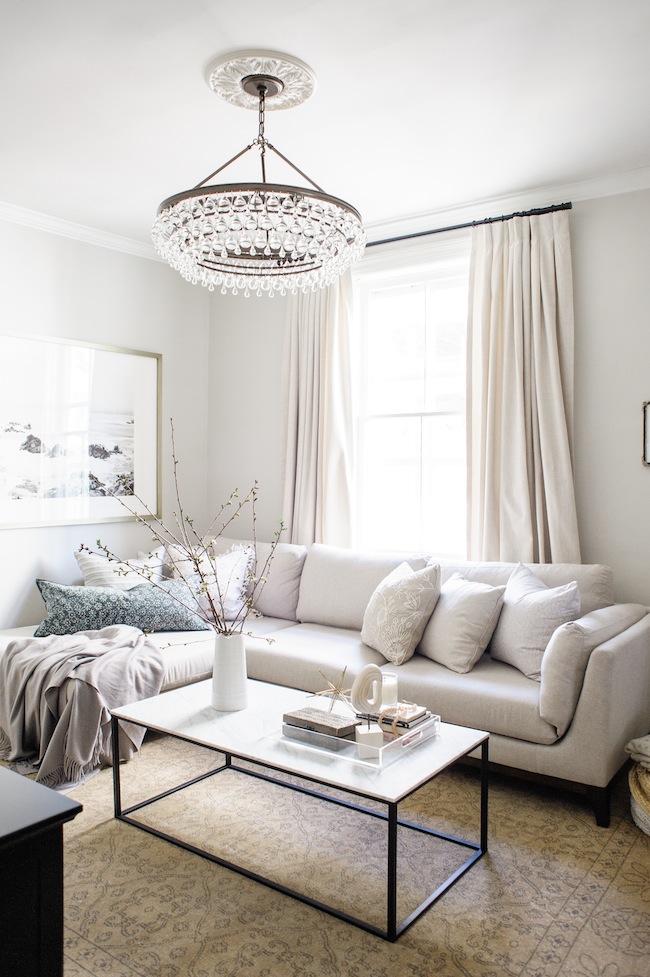
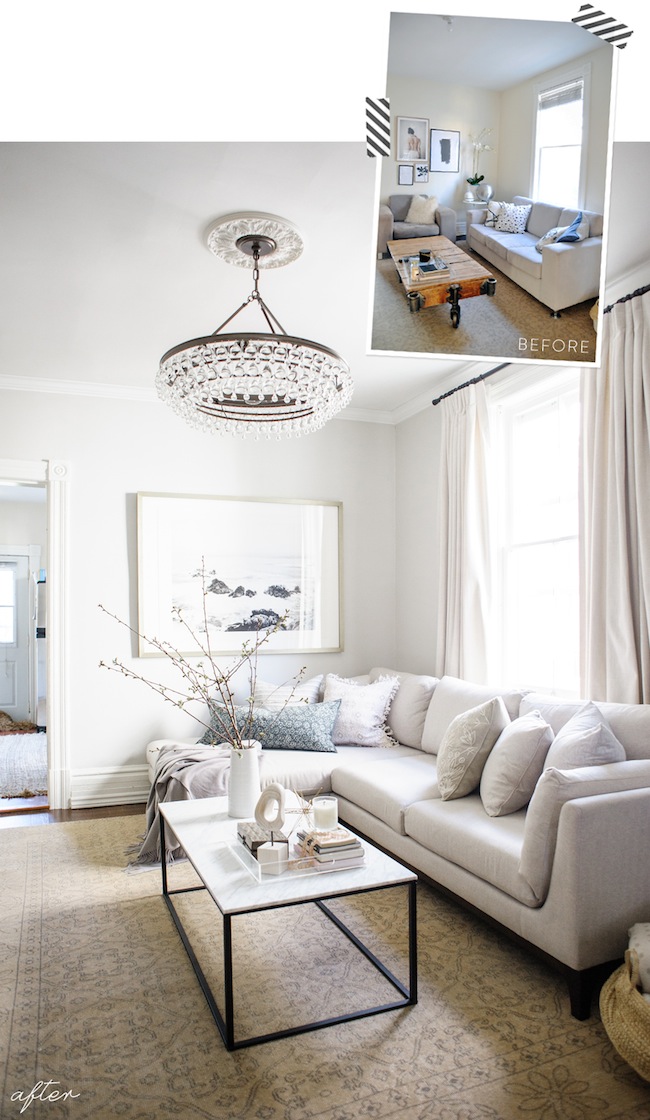
I’m actually amazed at the transformation that can take place in a few short weeks. You may remember where our living room first began (if not, allow me to introduce you), and today I’m thrilled to be sharing the full reveal. With photos from my talented friend Heidi Lau, read on for all of the details…
 If you’re new here, allow me to make a brief introduction. My fiancé, Justin, and I purchased an old Victorian home in Toronto last summer. And while it boasted some incredible bones (like 10″ baseboards), it was definitely in need of some love. I actually did a video tour (here) a few days after we took possession, and we’ve slowly been picking away at each space room by room ever since. So when Linda, the genius behind the One Room Challenge, reached out to us just a few short weeks ago and asked if we wanted to participate in this season’s challenge it was a bit of a no brainer.
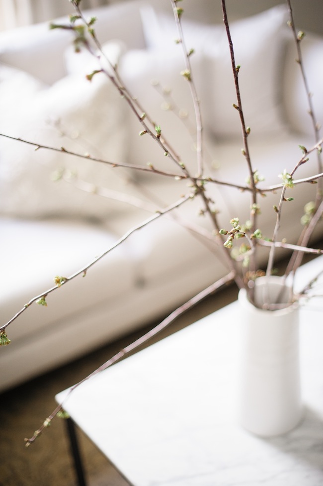
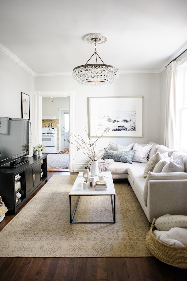
We decided to tackle our living room, which wasn’t terrible to begin with, but it felt lackluster and underwhelming – not a space in which either of us were excited to come home to at the end of a long day. (You can see all of our before’s right here, if interested)
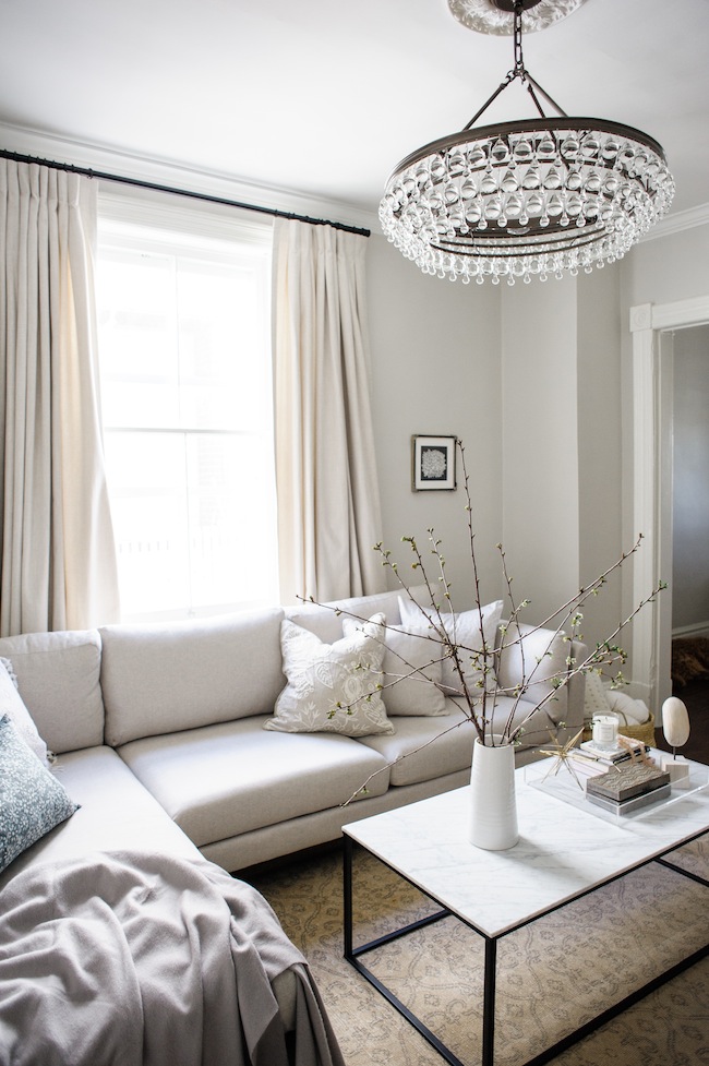
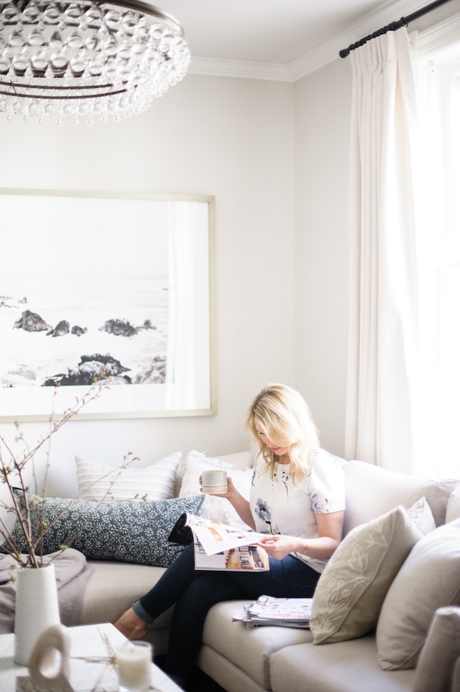
The goal from the get go was to create a sanctuary; a casual spot that felt elegant and pulled together, but not too stuffy. One in which we were excited to spend time in. To host friends, or to snuggle up with a movie and a big ol’ bowl of popcorn.
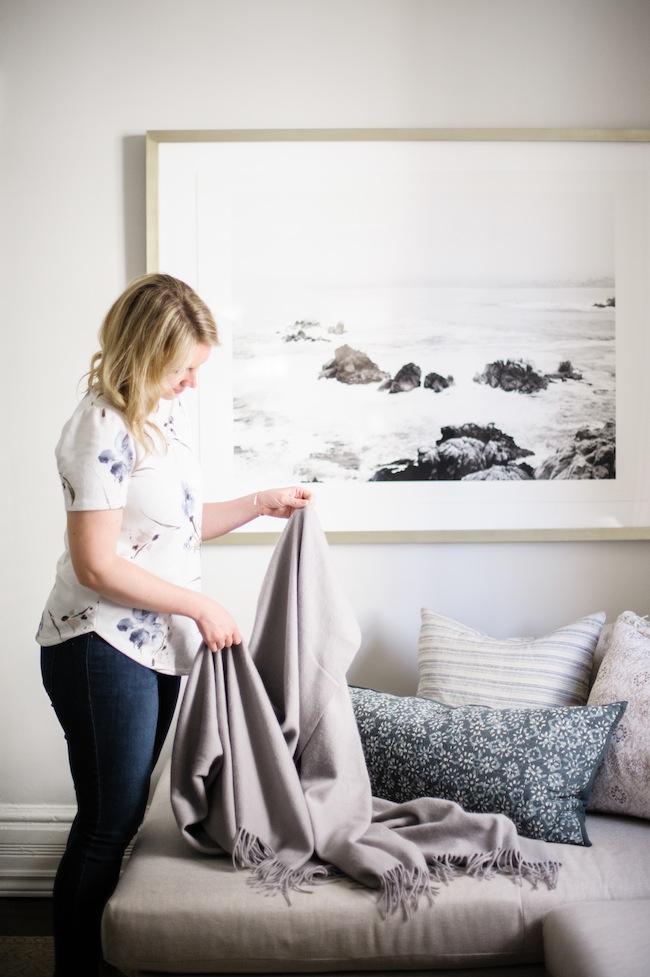
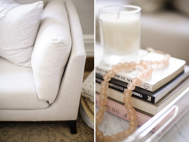
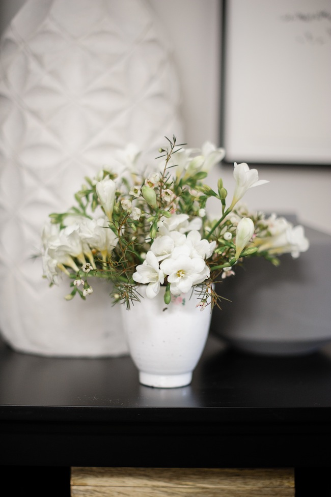
We started with a few inspiration photos (here) that really captured the vibe we were after. And from there, we were off to the races. We installed some simple crown moulding crown moulding, that felt in keeping with the period of our home, exchanged the venetian blinds for custom linen drapes, and gave the walls a lick of soft grey paint (Farrow & Ball’s Amonite White , for those of you who’ll ask.)
From there, an extra deep sectional from AllModern set the stage. While it was admittedly nerve-wracking to select a couch online without testing it out, we relied heavily on the reviews, and we’re thrilled to say it’s literally perfect. It’s firm enough to feel tailored and elegant while we’re entertaining like real grown ups. But plush (and deep) enough to really allow us to cozy up for movie nights with friends.
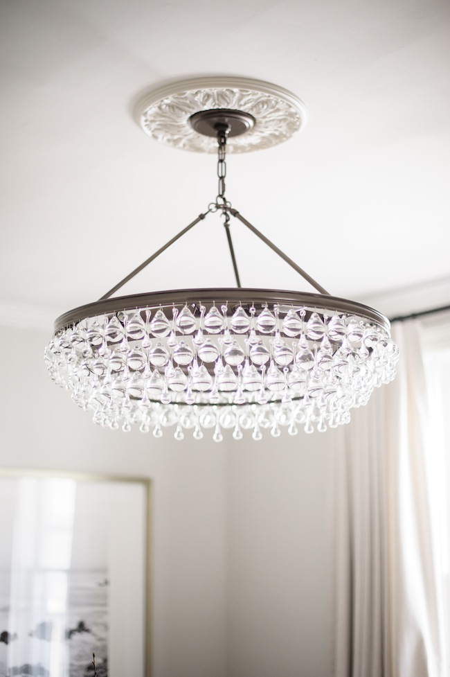
For the first eight months of our lives here, we lived with an exposed light bulb. So, to be totally honest, a change of any variety would have been an automatic upgrade. But the fact that we were able to incorporate this glass and iron beauty from Crystorama (one in which I’ve been lusting after for years) was just icing on the cake. I love that it feels totally timeless, yet intrinsically modern in the same breath. It bridges that gap beautifully and really feels as if it was made for our space.
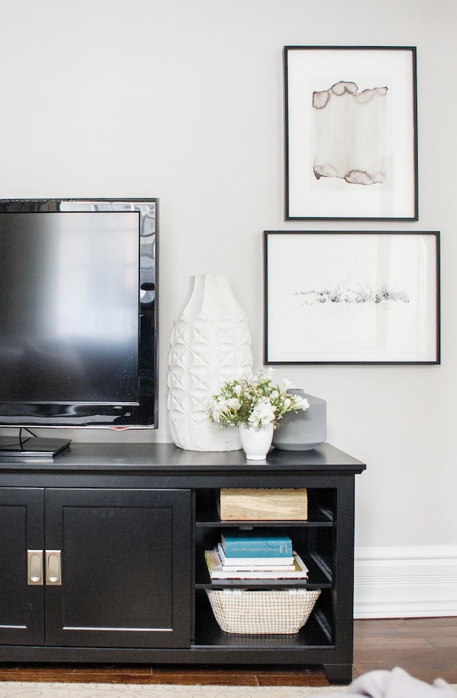
An extra wide media cabinet pulls double duty – hiding all of our cable boxes (because real people actually live here), all while giving us storage space for pretty little details when the TV is not in use. Form meets function and it’s simply glorious.
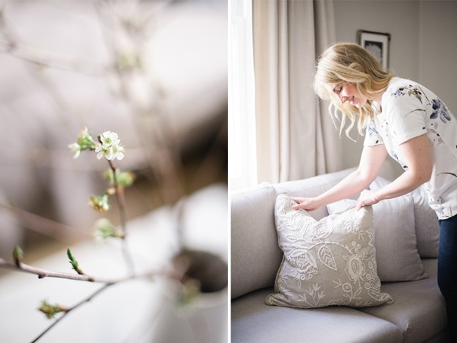
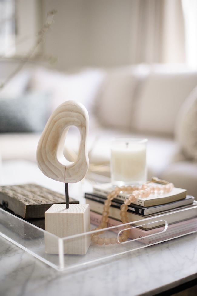
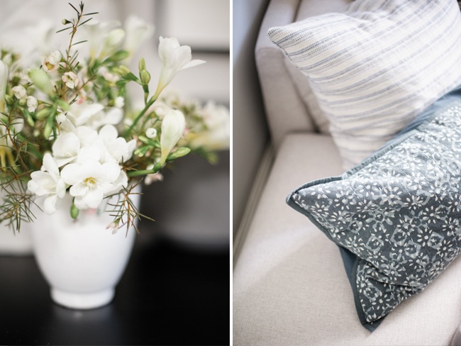
With a solid foundation in place, we slowly began adding in all of those incredible layers. Those essentials bits and pieces that make a house feel like a home. From sumptuous toss cushions to smokey-scented candles I always say that design is in the details, and I feel like this room has them en masse.
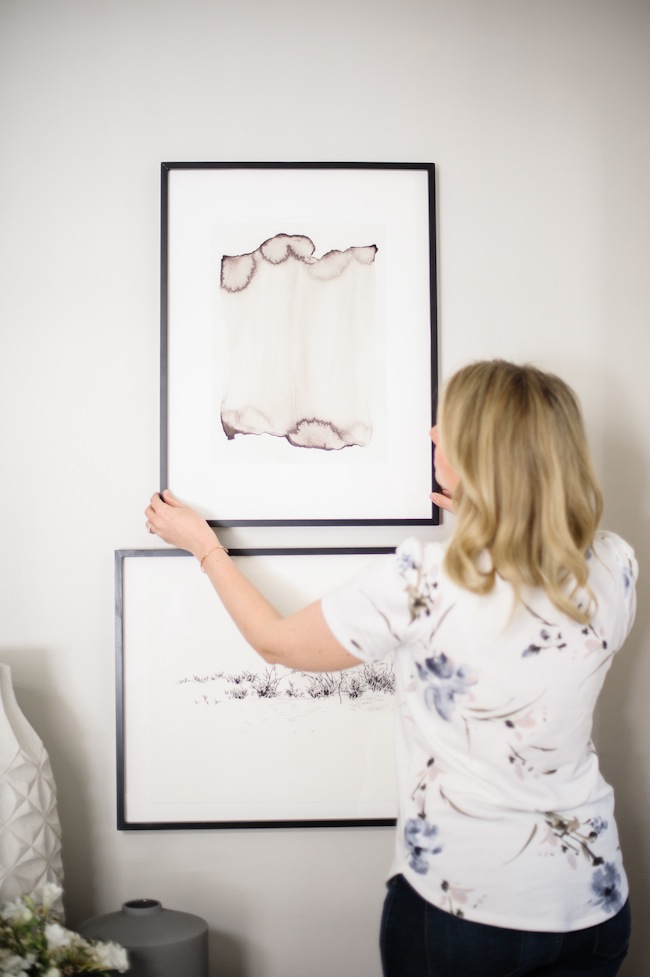
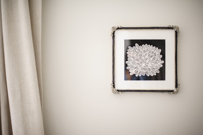
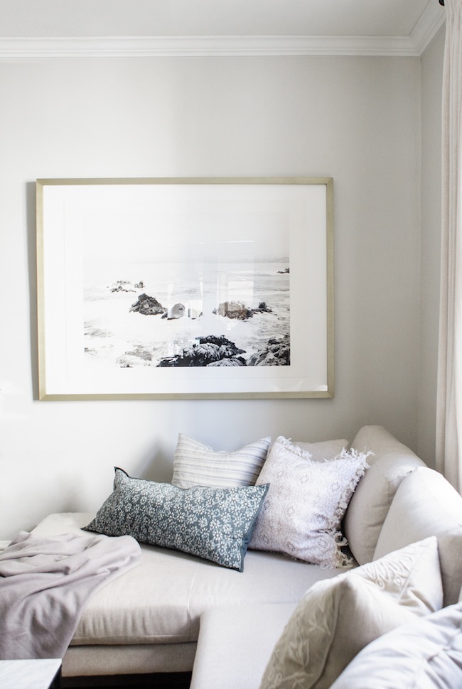
Beautiful art from Minted adorns our walls. And I love that it all came framed and ready to hang – necessary when working with a tight timeline. 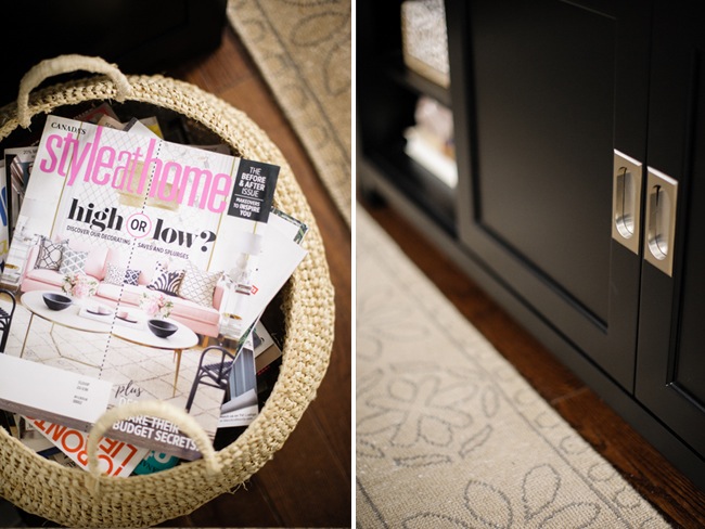
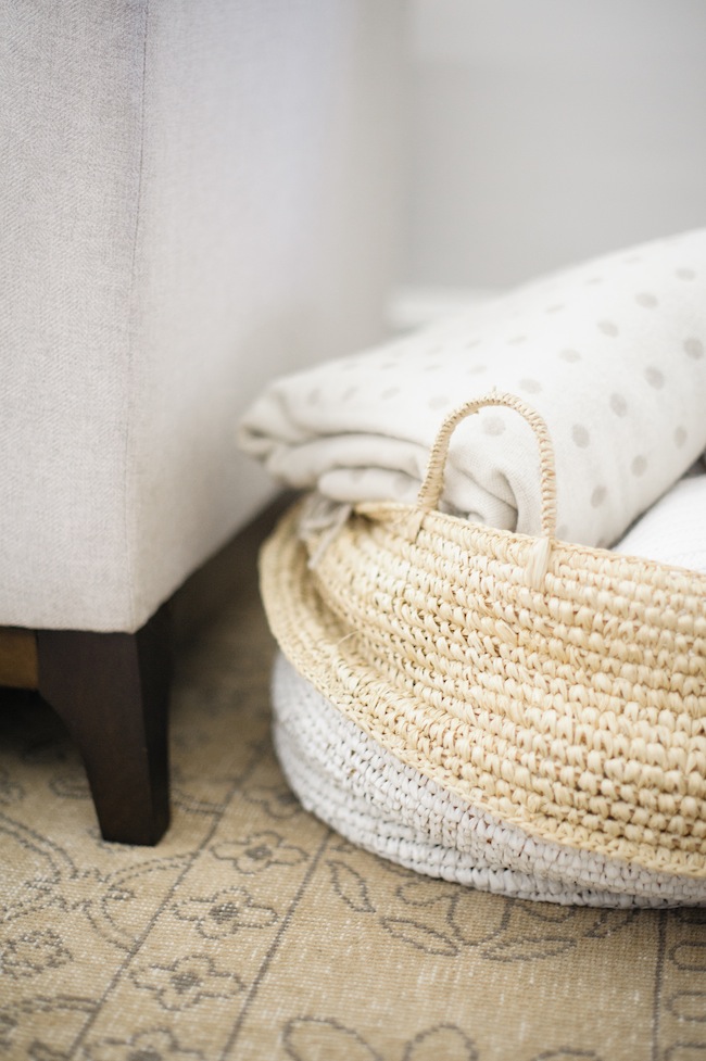
A basket of blankets is a non negotiable in any client’s space. It instantly adds a cozy factor that can’t be beaten. 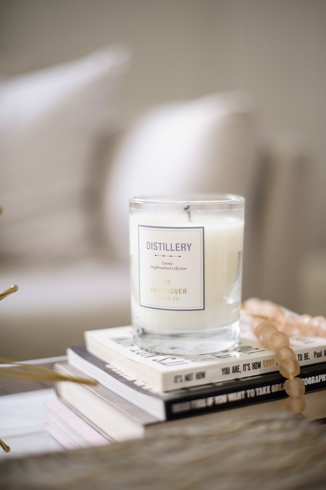
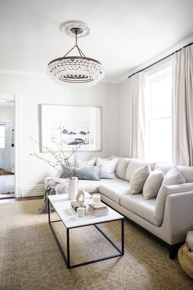
There you have it. Our living room in all of it’s glory. I’d love to hear your thoughts! And thank you again for following along on this journey. It’s been so much fun.
If you have the chance, you may want to check out the rest of this season’s One Room Challenge participants’ reveals. It’s been a pleasure to join them for the last few weeks:
Centsational Girl | Chris Loves Julia
Christine Dovey | Dwell With Dignity
The English Room | Glitter Guide
House of Brinson | House Updated
J+J Design Group | Abby Manchesky
Nesting Place | Old Brand New
Old Home Love | The Pink Pagoda
Rambling Renovators | Erica Reitman
Sketch 42 | Suburban B’s | Erin Williamson
Media Partner House Beautiful | TM by CIH
Photography: Heidi Lau
Sectional: AllModern | Custom Curtains: Tonic Living | Ceiling Medallion: Lowes | Chandelier: Crystorama | Crown Moulding: Metrie | Cashmere Blanket: Annie Selke | Wall Paint:Farrow & Ball – Amonite White | Embroidered Throw Pillow: Pine Cone Hill | Snake Print Throw Pillow: Annie Selke | Tassel throw Pillow: Pine Cone Hill | Striped Throw Pillow:Pine Cone Hill | Lumbar Throw Pillow: Pine Cone Hill | Marble Coffee Table: AllModern | Kaydi Bishop’s Torched Art: Minted | Actinomar’s Graphic Leaves Print: Minted | Yuke Li’s Wild Grass Art: Minted | Lamp (not pictured): Bellacor | Media Unit: AllModern | 18) Helina Chin’s Seascape Art: Minted | Blanket/Magazine Basket: Serena & Lily | Wood Sculpture: West Elm| Carved Boxes: Home Sense (similar here) | White Vase: Home Sense (similar here) | Coasters: Etsy



Youv’e created a beautiful room to enjoy and entertain. The chandelier is just lovely as are the drapes, the art, and the sofa! Oh – and the rug! Everything came together beautifully, Jacquelyn!
Such an incredibly warm inviting room…i hope I get to sit on that cosy couch some day!!!
Thank you so much, Jordana!
So chic and sophisticated. Bravo on surviving the One Room Challenge and a stunning reveal!
This looks like such a cozy space. Job well done!!
what a beautiful, serene, relaxing space you’ve created! i love the artwork so much!
I am loving that soft and neutral color pallete! It feels so serene and you did an amazing job at transforming this room :)
Absolutely stunning Jacquelyn! So much inspiration in every post! I love how you always stay true to your palette!
This room is beautiful, warm, and inviting Jacquelyn! The sectional is fabulous and I love your art selections. Well done!
So beautiful!! On a separate note, I love your top! Can you share where it’s from?
It looks beautiful – love the new coffee table!
http://www.shopthecoconutroom.com
Looks really pretty. You did a wonderful job.
Love the warm earthy palate and how cozy but still chic your space is. It definitely looks like a room that is both super comfortable for everyday living but also so perfectly elegant for entertaining etc. Great job!!!!
So soft and pretty! I love the thoughtful and beautiful details. Congrats! You made it lovely.
Congratulations on a beautiful ORC! I’ve visited them all and you are my favourite. Added bonus – a fellow Canadian!
That’s so kind, thank you Kelly!
It looks fabulous…
This room is gorgeous! One of my favorites. Would you mind sharing the rug source? I search the post and couldn’t find a mention or link.
Of course! It’s from Elte. I bought it at their warehouse sale last fall
You did an amazing job! I love that it looks sophisticated but also cozy and welcoming – a perfect mix of upscale but livable.
It’s so lovely. Just peaceful and simple yet not boring in the slightest. I love the wall color you chose- such a perfect shade of gray. Beautiful work!!
congrats, you really made this space cozy and inviting. I love it!
I also shared my reveal today, check it out here: http://www.charlestoncrafted.com/2017/05/10/orc-reveal-fully-diy-remodeled-walk-master-closet/
Lovely room! Very zen! Enjoy! (Loved the little cameo of Sage too!)
haha I think she’s hidden in virtually every one of my photos these days
I absolutely love this room! Could you tell me what paint color you used on the walls? I must use it!
All of the credits are at the bottom of the post!
It’s so pretty and serene, and I love the layers of texture.
Very gentle and romantic.
thiết kế nhà xinh
[…] 3. Lark & Linen […]
Such a gorgeous makeover. It’s definitely one of my favourites. Great job!
Well isn’t that sweet. Thank you!
what a sensational living room with all the softness one would want in the entire world! the palette is delicate, the textile is luxurious, and your styling is simply perfection! My favourites will have to be the chandelier (have a similar version in my foyer) and those dreamy drapes!!
love that you round the space with small doses of black accent … that’s the perfect touch! Bravo and can’t wait to see more of your work in prints too!
Tim, this means so much coming from you. Thank you so much for your kind words!
What a beautiful room. I love the pale colors and the touches of black. That chandelier is a show-stopper. Really lovely.
[…] favorite of mine is Lark and Linen. Can you believe this soothing, beautiful space is a hang out room with a tv and sectional? Of […]
Yes, can you source the rug?
It’s from Elte!
What a gorgeous room! I could spend some serious couch time in there!
SO pretty! I looks so peaceful :) I love the drapes how you kept them the same as the wall colours so a seamless transition. Your artwork, gahhhh its so pretty! Well done, well done:)
Thank you so much <3
Oh, it’s just beautiful! Such a pulled together, but still friendly looking space. Nicely done!
Thank you, Emily!
Very pretty, love the beautiful lighting!
It does look like a cozy space – good job!
In this post good explanation about home decor. This post helpful for many people.In this post also give good information about Home Design that helps people.
Beautiful! I especially love the Farrow and Ball grey on the walls. How do you go about choosing paint colors? Dive into the paint fan decks and see what jumps out? I feel like I never quite know where to start. Any tips you have for blogs that focus on paint colors (is there such a thing?) or lists of the season’s best would be appreciated!
Jacquelyn, this is stunning….my favorite reveal so far! I love the sophisticated look you’ve achieved while maintaining an inviting, cozy feel. The drapes are fabulous. I love that you went with a fuller look than we typically see. The pillows are also gorgeous and that chandelier!!!! It’s one I’ve loved since the first time I saw it. So stunning!
Well isn’t that sweet. Thank you so much for your kind words, Jennifer
I love the warmth of this room. The chandelier is absolutely gorgeous! Well done.
Thank you, Ola!
I love photos throughout your blog! In this post the faint colours really enhance all the details in the room. Such a good and elegant taste. Congratulationg for your blog.
Thank you so much!
I love your transformation! It is beautiful. Would you mind sharing the frame style you chose for the seascape print. It is stunning!
I chose the champagne silver metal frame!
Love the big comfy looking couch, squishy basket and rug. But the burning question….where did you get your black and white striped washi (?) tape that you taped to the before photo.lol?
hahaha I just found it on google images!
Hi Jacquelyn. One burning question…how do you like this sofa? We’re thinking of buying online but only see few reviews.
We LOVE this sofa. It’s a little firmer than we were originally thinking, but it’s still quite comfortable. It feels more formal and tailored when you have lots of people sitting around it, but the sectional portion is cozy enough for two to cuddle up in for movie nights. It’s legitimately perfect
What a beautiful space! Such an inspiration! Would you mind sharing the fabric used for the drapes?
Of course! It’s from Tonic Living and it’s their Victoria fabric in Oyster
[…] See more at Lark & Linen » […]
[…] delish) and a good movie? Scroll for the room tour with photography by Heidi Lau and make sure to head to Lark & Linen to see the before pic and all of the sources. Oh, AND she’s back tomorrow for our Haven Maven series with lots of fun […]
[…] Source: Lark & Linen […]
[…] Source: Lark& Linen […]