I’ve always said that I’m not one to gate keep. There are so many arguments for both sides of this discussion, and I know that every designer is different on this front, which I respect implicitly. But I’ve always felt it’s important for me to share sources and details when I’m able.
Shop the Post:
I believe that good design is meant to be enjoyed by as many people as possible. And I know for a fact that it isn’t nearly as simple as having a list of sources and finishes on hand. To me, there’s so much that goes into a well designed space. And I don’t think that sharing the ins and outs of how I, personally, do it waters down my craft. I believe that my art will continue to be my art whether or not someone else uses the same tools.
If my sources help guide someone, even a little, who loves beautiful things but doesn’t have the ability to work with a designer I’m all the more pleased. And if I’m able to send some business to the vendors and suppliers whom I adore while I’m at it, then heck, even better.
So with that in mind, and while I wait for my sconces to arrive*, I wanted to take a moment to break down some of the finishes we ended up with in our new kitchen. It’s legitimately killing me that I haven’t been able to shoot and share it yet, but hopefully this will tide me (us?) over in the meantime.
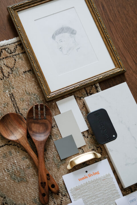
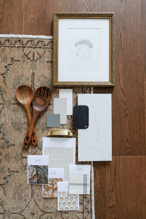
Since this isn’t our forever home, I wanted our kitchen to be widely appealing to a possible future owner, without sacrificing my own style and aesthetic. Our home was built in 1898 and is filled to the brim with character (wonky floors, 10″ baseboards and all). Those details are important to me, and they’re something that I wanted to maintain, all while introducing layers of the 21st century.
Since kitchen renovations are such an expensive endeavour, it was really important to me to focus on timeless, classic kitchen finishes for the items that are difficult, or costly, to switch out down the line. That means the cabinets, floors, and counters (I love our countersss) needed to be items that I knew I’d love for years to come, and that have mass appeal.
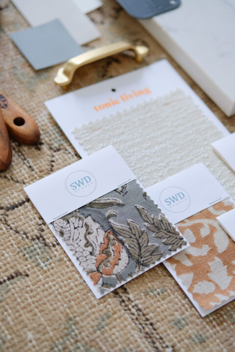
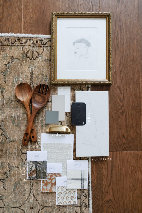
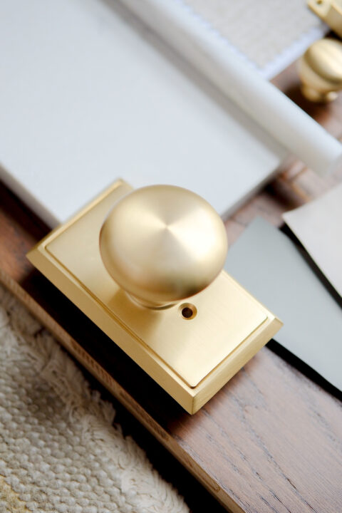
With those first layers nailed down, I was able to play around with the finishing touches (my favourite). Beautiful cabinet hardware from Emtek & Schaub, in the prettiest satin brass hue, help offset all the cooler tones. And meaningful art, scatter rugs, toss cushions, final accessories, and things that are much easier to switch out down the line as tastes ebb and flow, is where I had extra fun.
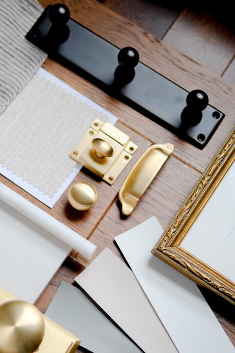
I love looking at these photos because it really does embody the feel of the final kitchen reveal – which is coming soon, I pinky swear. So much joy all around! I’m so happy and think it will all be worth the wait.
*they’re the LAST (backordered) item left before I can finally photograph our kitchen reveal

SOURCES

KITCHEN FINISHES
Flooring: Fuzion | Counters: Hanstone Quartz, Montauk
HARDWARE
Cabinet Knob: Schaub, in satin brass | Cabinet Cup Pull: Schaub, in satin brass
Cabinet Latch: Emtek, in satin brass | Door Knob & Rosette: Emtek
Wall Hooks: Emtek
PAINT
Wall Colour: Benjamin Moore – AF-15 – Steam
Cabinet Colour: Benjamin Moore – CC-460 – Inukshuk
Trim & Ceiling Colour: Benjamin Moore – OC65 – Chantilly Lace
Hallway (Accent) Colour: Benjamin Moore – HC-168 – Chelsea Gray
FABRIC, ART & ACCESSORIES
Bench Fabric: Tonic Living| Rug: Etsy
Art: A Piece I Drew in High School, Framed (similar frame)
Green Floral Fabric: SWD Studio | Camel Floral Fabric: SWD Studio
Ditsy Floral Fabric: SWD Studio | Plaid Fabric: SWD Studio
Wooden Spoon Set: Amazon

RELATED POSTS

START HERE: OUR RENOVATION PLANS
OUR EXTERIOR RENOVATION PLANS
A RENOVATION UPDATE (THE PIVOT)
OUR KITCHEN INSPIRATION
OUR KITCHEN DRAWINGS
A CONSTRUCTION UPDATE
OUR KITCHEN ELEVATIONS
filed in /


Thank you for sharing your Beautiful designs! Your content is fabulous!
That’s so nice to hear, thank you so much!
I love the handles you bought for your doors and drawers. I agree that classic never goes out of fashion. I can see this same handles in fashion twenty or thirty years from now. Congratulations on your excellent good taste.
Thank you so much!